Connect with us

Brands

Dream11 ropes in MS Dhoni as brand ambassador

Published

on

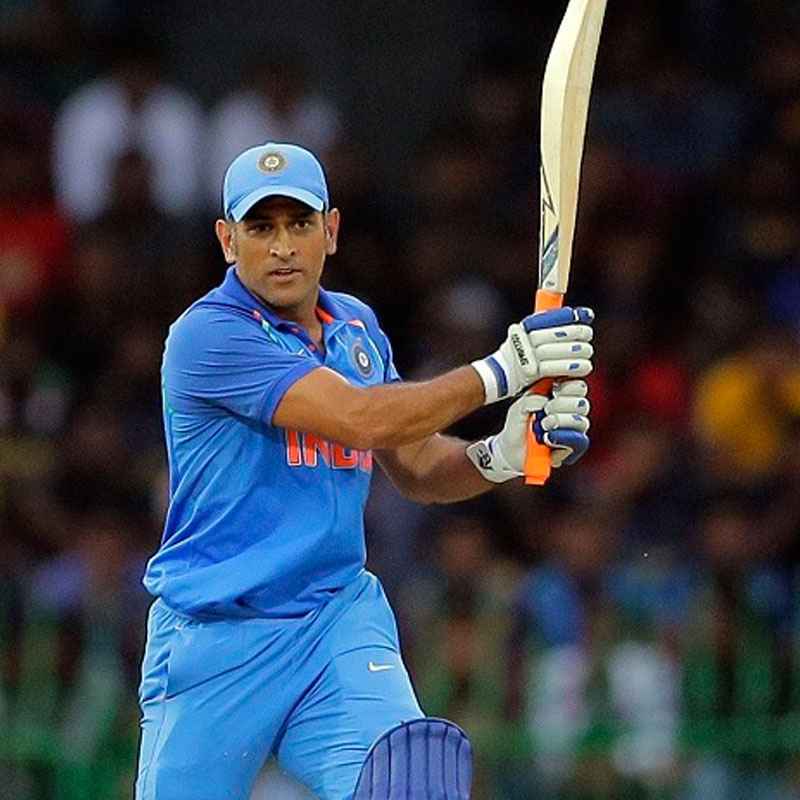
MUMBAI: Indian online sports gaming platform Dream11 has announced cricketer Mahendra Singh Dhoni as its new brand ambassador. The former Indian captain will be the new face of Dream11’s multi-channel marketing campaigns and brand engagement activities.

Dream11 is a game of skill that offers sports fans a platform to showcase their knowledge. Dhoni’s immense popularity will play a significant role for attracting more users.

Dhoni is delighted on the new association and said, “It gives millions of sports fans an opportunity to be the decision maker, create their own team and experience the game first-hand. The Dream11 platform perfectly defines the importance of choosing the right players and building a team as per the playing conditions.”

Advertisement

“We are thrilled to have Dhoni on board, who is well-known for being a strategic thinker and a visionary leader – attributes that resonate perfectly with Dream11’s brand proposition. This partnership is impeccably timed with Dream11’s next phase of growth and the unveiling of its new logo and visual identity. We believe that our association with Dhoni will further build the Dream11 brand, enabling sports fans to experience our unique format,” said Dream11 CMO Vikrant Mudaliar.

On Dream 11 platform fans can create their own team of real-life players from upcoming matches, score points based on on-field performance and compete with other fans. It helps sports fans increase their engagement and connect deeper with the sport they love by being a team owner, not just a spectator.

Also Read:

Advertisement

HARMAN announces Priyanka Chopra as global brand ambassador

Irrfan Khan is Mastercard’s first Indian brand ambassador

Advertisement
Click to comment

Leave a Reply

Your email address will not be published. Required fields are marked *

Brands

Godrej clarifies ‘GI’ identifier after logo similarity debate

Says GI is not a logo, will not replace Godrej signature across products.

Published

on

MUMBAI: In a branding storm where shapes did the talking, Godrej is now spelling things out. Godrej Industries Group (GIG) has issued a clarification on its newly introduced ‘GI’ identifier, addressing questions around its purpose and design following a wave of online criticism. At the centre of the debate were two concerns: whether the new mark replaces the long-standing Godrej logo, and whether its geometric design mirrors other corporate identities.

The company has drawn a clear line. The Godrej signature logo, it said, remains unchanged and continues to be the sole logo across all consumer-facing products and services. The ‘GI’ mark, by contrast, is not a logo but a corporate group identifier intended for use alongside the Godrej signature or company name, and aimed at stakeholders such as investors, media and talent rather than consumers.

The need for such a distinction stems from the 2024 restructuring of the broader Godrej Group into two separate business entities. With both continuing to operate under the same Godrej name and signature, the identifier is positioned as a way to differentiate the Godrej Industries Group at a corporate level.

Advertisement

The rollout, however, triggered a broader conversation on design originality. Critics pointed to similarities between the GI mark’s geometric composition and logos used by companies globally, raising questions about distinctiveness.

Responding to this, GIG said its intellectual property and legal review found that such overlaps are common in minimalist, geometry-led design systems. Basic forms such as circles and rectangles appear across dozens of brand identities worldwide, the company noted.

It added that the identifier emerged from an extensive design process and was chosen for its simplicity, allowing it to sit alongside the Godrej signature without competing visually. While acknowledging that elemental shapes may appear less distinctive in isolation, the group emphasised that the mark is part of a broader identity system that includes a custom typeface, sonic branding and other proprietary elements.

Advertisement

Following legal and ethical assessments, the company said it found no impediment to using the identifier, reiterating that the GI mark is a corporate tool not a consumer-facing symbol.

In short, the logo isn’t changing but the conversation around it certainly has.

Advertisement
Continue Reading

Advertisement News18
Advertisement
Advertisement
Advertisement
Advertisement Whtasapp
Advertisement Year Enders

Indian Television Dot Com Pvt Ltd

Signup for news and special offers!

Copyright © 2026 Indian Television Dot Com PVT LTD

This will close in 10 seconds