Brands
DeVANS sparks buzz with self-chilling beer can April Fools campaign
Godfather stunt racks up 7 million impressions, blending humour with hype
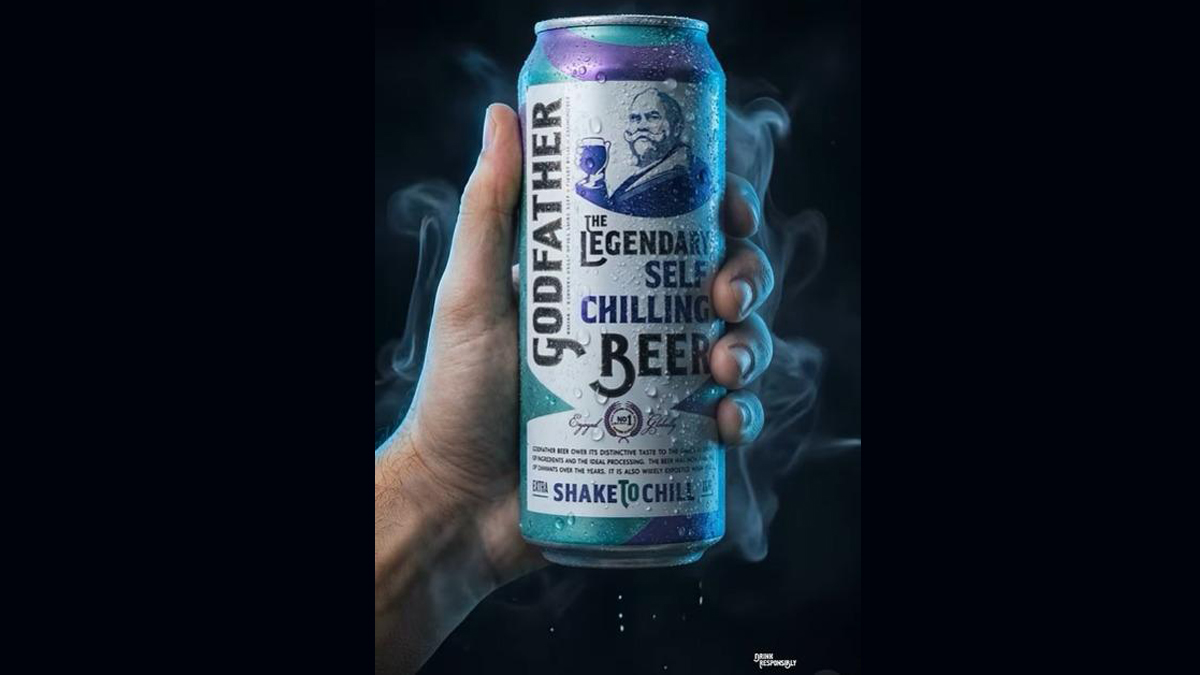
NEW DELHI: DeVANS Modern Breweries has stirred up the marketing pot with a playful yet high-impact campaign teasing a futuristic “self-chilling beer can” under its flagship Godfather label.
What began as a seemingly bold product innovation quickly turned into one of the most talked-about brand moments online, before being revealed as an April Fools’ Day prank. The reveal, however, did little to cool the buzz.
The campaign clocked over 7 million organic impressions across platforms including LinkedIn, Instagram, Facebook and X, with users debating whether the concept was a genuine breakthrough or clever marketing theatre. Thousands of shares and comments turned the idea into a full-blown conversation, drawing in both consumers and industry insiders.
The hook was simple but effective. A self-chilling can positioned as an on-the-go convenience product tapped into the imagination of younger, urban audiences. Add the timing around April Fools’ Day, and the campaign struck the perfect balance between curiosity and scepticism, keeping audiences guessing.
Marketing experts have pointed to the campaign as a case study in leveraging cultural moments. By leaving just enough ambiguity, the brand invited audiences to participate rather than simply observe, turning passive viewers into active contributors to the narrative.
“Godfather has always been an iconic brand, but iconicity must evolve to stay meaningful,” said DeVANS Modern Breweries chairman and managing director Prem Dewan. “The ‘Self-Chilling Can’ was our way of showing up in a cultural moment with confidence and a sense of humour.”
Beyond the numbers, the campaign signals a broader repositioning for Godfather. Long seen as a legacy beer brand, it is now leaning into youth culture, digital-first storytelling and topical engagement to stay relevant in a crowded alcobev market.
In a space where attention is fleeting, DeVANS has shown that sometimes the coolest idea is the one that keeps people guessing.
Brands
Godrej clarifies ‘GI’ identifier after logo similarity debate
Says GI is not a logo, will not replace Godrej signature across products.
MUMBAI: In a branding storm where shapes did the talking, Godrej is now spelling things out. Godrej Industries Group (GIG) has issued a clarification on its newly introduced ‘GI’ identifier, addressing questions around its purpose and design following a wave of online criticism. At the centre of the debate were two concerns: whether the new mark replaces the long-standing Godrej logo, and whether its geometric design mirrors other corporate identities.
The company has drawn a clear line. The Godrej signature logo, it said, remains unchanged and continues to be the sole logo across all consumer-facing products and services. The ‘GI’ mark, by contrast, is not a logo but a corporate group identifier intended for use alongside the Godrej signature or company name, and aimed at stakeholders such as investors, media and talent rather than consumers.
The need for such a distinction stems from the 2024 restructuring of the broader Godrej Group into two separate business entities. With both continuing to operate under the same Godrej name and signature, the identifier is positioned as a way to differentiate the Godrej Industries Group at a corporate level.
The rollout, however, triggered a broader conversation on design originality. Critics pointed to similarities between the GI mark’s geometric composition and logos used by companies globally, raising questions about distinctiveness.
Responding to this, GIG said its intellectual property and legal review found that such overlaps are common in minimalist, geometry-led design systems. Basic forms such as circles and rectangles appear across dozens of brand identities worldwide, the company noted.
It added that the identifier emerged from an extensive design process and was chosen for its simplicity, allowing it to sit alongside the Godrej signature without competing visually. While acknowledging that elemental shapes may appear less distinctive in isolation, the group emphasised that the mark is part of a broader identity system that includes a custom typeface, sonic branding and other proprietary elements.
Following legal and ethical assessments, the company said it found no impediment to using the identifier, reiterating that the GI mark is a corporate tool not a consumer-facing symbol.
In short, the logo isn’t changing but the conversation around it certainly has.


