Brands
Delhi’s Loya Qissa welcomes Mexico’s Aruba bar takeover
MUMBAI: When Delhi’s iconic Loya says “cheers” it does so with stories. Its much-loved bar takeover series, Qissa, is back. This time shaking things up with a spirited cross-continental collaboration.
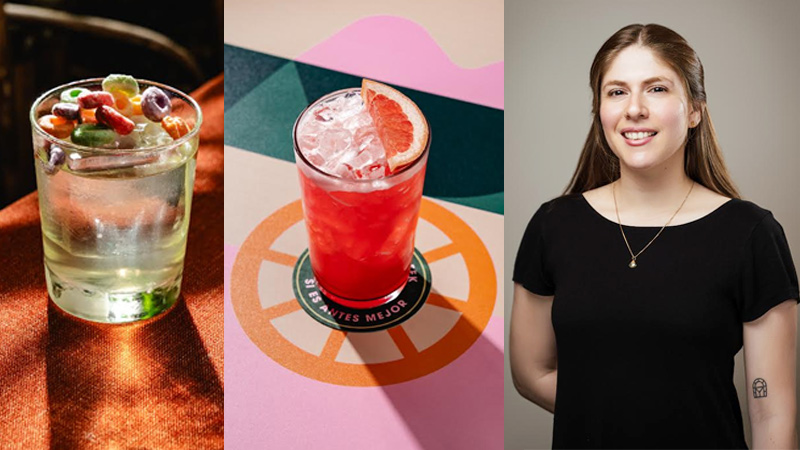
Flying in from Tijuana, Mexico, the celebrated Aruba day drink bar, ranked No. 22 in North America’s 50 best bars 2025, is stepping behind Loya’s counter. At the helm is Frida González, Aruba’s co-owner and one of the brightest forces in Baja California’s cocktail culture.
González is known for crafting ingredient-forward drinks that are as vibrant as they are honest, championing a style that feels playful yet deeply rooted in Mexico’s northwest coast. Under her watch, the takeover promises a sun-drenched menu echoing Aruba’s signature ‘daytime conviviality’: fresh, bold, and layered with Baja narratives.
Think zesty pours brimming with Mexican flavours, inventive techniques, and a dash of storytelling, all served against Loya’s backdrop of north Indian artistry and flavour.
After its showcase at Loya, Taj Palace, New Delhi, this edition of Qissa won’t stop there. The collaboration will pack its shakers and journey to Mumbai’s The Taj Mahal Palace, and Bengaluru’s Taj West End carrying a dialogue of craft and culture across three cities.
Brands
Godrej clarifies ‘GI’ identifier after logo similarity debate
Says GI is not a logo, will not replace Godrej signature across products.
MUMBAI: In a branding storm where shapes did the talking, Godrej is now spelling things out. Godrej Industries Group (GIG) has issued a clarification on its newly introduced ‘GI’ identifier, addressing questions around its purpose and design following a wave of online criticism. At the centre of the debate were two concerns: whether the new mark replaces the long-standing Godrej logo, and whether its geometric design mirrors other corporate identities.
The company has drawn a clear line. The Godrej signature logo, it said, remains unchanged and continues to be the sole logo across all consumer-facing products and services. The ‘GI’ mark, by contrast, is not a logo but a corporate group identifier intended for use alongside the Godrej signature or company name, and aimed at stakeholders such as investors, media and talent rather than consumers.
The need for such a distinction stems from the 2024 restructuring of the broader Godrej Group into two separate business entities. With both continuing to operate under the same Godrej name and signature, the identifier is positioned as a way to differentiate the Godrej Industries Group at a corporate level.
The rollout, however, triggered a broader conversation on design originality. Critics pointed to similarities between the GI mark’s geometric composition and logos used by companies globally, raising questions about distinctiveness.
Responding to this, GIG said its intellectual property and legal review found that such overlaps are common in minimalist, geometry-led design systems. Basic forms such as circles and rectangles appear across dozens of brand identities worldwide, the company noted.
It added that the identifier emerged from an extensive design process and was chosen for its simplicity, allowing it to sit alongside the Godrej signature without competing visually. While acknowledging that elemental shapes may appear less distinctive in isolation, the group emphasised that the mark is part of a broader identity system that includes a custom typeface, sonic branding and other proprietary elements.
Following legal and ethical assessments, the company said it found no impediment to using the identifier, reiterating that the GI mark is a corporate tool not a consumer-facing symbol.
In short, the logo isn’t changing but the conversation around it certainly has.


