Brands
Cushioning the future: Centuary unveils sofa line
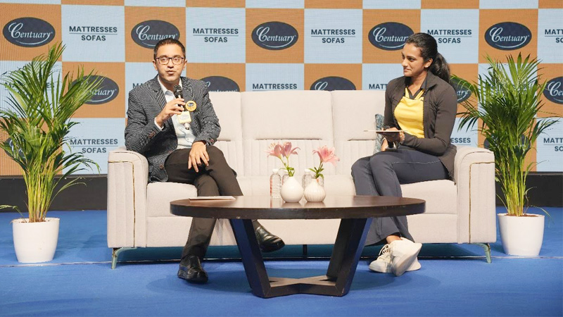
MUMBAI: From snooze to sit-back, Centuary Mattresses is stretching its comfort credentials beyond the bedroom. India’s “Sleep Specialist” has now stepped into the living room with the launch of Centuary Sofas, unveiled in Hyderabad by brand ambassador and badminton ace PV Sindhu.
After three decades of perfecting mattresses and pillows, the company is re-engineering its foam science for seating. The new range spans loungers, singles, doubles, and three-seaters, promising what the brand calls “Smart inside, soft outside” durability and ergonomics wrapped in plush style.
“For over 30 years, we’ve been India’s trusted name in sleep comfort. Expanding into sofas is a natural progression,” said Centuary Sofas executive director Uttam Malani. “Sofas are central to family life, and we’re proud to bring the same trust and comfort into living rooms.”
Sindhu, who champions rest as much as performance, echoed the sentiment: “Just as Centuary mattresses have been about better sleep, these sofas will now be about better living.”
Crafted in India with certified foams, pine wood frames, and ergonomic designs, the sofas are available across Centuary’s retail network, exclusive stores, online platforms, and leading e-commerce sites.
Looks like Centuary isn’t just making India sleep better, it’s making the country sit prettier too.
Brands
Godrej clarifies ‘GI’ identifier after logo similarity debate
Says GI is not a logo, will not replace Godrej signature across products.
MUMBAI: In a branding storm where shapes did the talking, Godrej is now spelling things out. Godrej Industries Group (GIG) has issued a clarification on its newly introduced ‘GI’ identifier, addressing questions around its purpose and design following a wave of online criticism. At the centre of the debate were two concerns: whether the new mark replaces the long-standing Godrej logo, and whether its geometric design mirrors other corporate identities.
The company has drawn a clear line. The Godrej signature logo, it said, remains unchanged and continues to be the sole logo across all consumer-facing products and services. The ‘GI’ mark, by contrast, is not a logo but a corporate group identifier intended for use alongside the Godrej signature or company name, and aimed at stakeholders such as investors, media and talent rather than consumers.
The need for such a distinction stems from the 2024 restructuring of the broader Godrej Group into two separate business entities. With both continuing to operate under the same Godrej name and signature, the identifier is positioned as a way to differentiate the Godrej Industries Group at a corporate level.
The rollout, however, triggered a broader conversation on design originality. Critics pointed to similarities between the GI mark’s geometric composition and logos used by companies globally, raising questions about distinctiveness.
Responding to this, GIG said its intellectual property and legal review found that such overlaps are common in minimalist, geometry-led design systems. Basic forms such as circles and rectangles appear across dozens of brand identities worldwide, the company noted.
It added that the identifier emerged from an extensive design process and was chosen for its simplicity, allowing it to sit alongside the Godrej signature without competing visually. While acknowledging that elemental shapes may appear less distinctive in isolation, the group emphasised that the mark is part of a broader identity system that includes a custom typeface, sonic branding and other proprietary elements.
Following legal and ethical assessments, the company said it found no impediment to using the identifier, reiterating that the GI mark is a corporate tool not a consumer-facing symbol.
In short, the logo isn’t changing but the conversation around it certainly has.


