Connect with us

Brands

Carlsberg and Liverpool FC recreate a miracle

Published

on

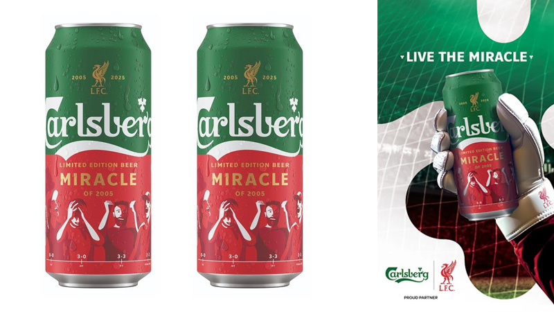
MUMBAI: It’s time to raise a can to one of football’s greatest comebacks! To mark 20 years of Liverpool FC’s unforgettable “Miracle of Istanbul”, Carlsberg India has unveiled the Carlsberg smooth limited-edition ‘Miracle of 2005’ Can, a stylish tribute to the night the Reds turned a 3–0 deficit into Champions League glory.

The campaign, aptly titled Live the Miracle, invites fans across Maharashtra, Karnataka, and Goa to relive the emotion of that night, one sip at a time. The can design fuses Liverpool’s iconic red with Carlsberg’s signature green, featuring timestamps of every pivotal moment from the match, echoing the highs, lows, and that unforgettable lift of the trophy.

But the celebration doesn’t stop at the can. Through the campaign, fans can step into goalkeeper Jerzy Dudek’s shoes in an interactive online game accessed via Carlsberg India’s Instagram or QR codes on retail displays. Winners stand to claim exclusive prizes, from Carlsberg x Liverpool FC merchandise and screenings with club legends to an all-expense-paid trip to Anfield.

Advertisement

“The Miracle of 2005 is more than just a match, it’s a story of resilience and passion,” said Carlsberg India vice president – marketing Partha Jha. “With ‘Live the Miracle’, we’re not just commemorating that night; we’re bringing it alive for Indian fans through experiences that go far beyond watching the game.”

The partnership between Carlsberg and Liverpool FC dates back to 1992, making it one of football’s longest-running collaborations. From the treble of 2001 to the miracle of 2005, the Carlsberg logo has stood proudly on the Reds’ chest through their most iconic victories.

Now, two decades later, that spirit of belief and camaraderie is bubbling over once again, in every limited-edition can that invites fans to live the miracle, sip by sip.
 

Advertisement
Click to comment

Leave a Reply

Your email address will not be published. Required fields are marked *

Brands

Godrej clarifies ‘GI’ identifier after logo similarity debate

Says GI is not a logo, will not replace Godrej signature across products.

Published

on

MUMBAI: In a branding storm where shapes did the talking, Godrej is now spelling things out. Godrej Industries Group (GIG) has issued a clarification on its newly introduced ‘GI’ identifier, addressing questions around its purpose and design following a wave of online criticism. At the centre of the debate were two concerns: whether the new mark replaces the long-standing Godrej logo, and whether its geometric design mirrors other corporate identities.

The company has drawn a clear line. The Godrej signature logo, it said, remains unchanged and continues to be the sole logo across all consumer-facing products and services. The ‘GI’ mark, by contrast, is not a logo but a corporate group identifier intended for use alongside the Godrej signature or company name, and aimed at stakeholders such as investors, media and talent rather than consumers.

The need for such a distinction stems from the 2024 restructuring of the broader Godrej Group into two separate business entities. With both continuing to operate under the same Godrej name and signature, the identifier is positioned as a way to differentiate the Godrej Industries Group at a corporate level.

Advertisement

The rollout, however, triggered a broader conversation on design originality. Critics pointed to similarities between the GI mark’s geometric composition and logos used by companies globally, raising questions about distinctiveness.

Responding to this, GIG said its intellectual property and legal review found that such overlaps are common in minimalist, geometry-led design systems. Basic forms such as circles and rectangles appear across dozens of brand identities worldwide, the company noted.

It added that the identifier emerged from an extensive design process and was chosen for its simplicity, allowing it to sit alongside the Godrej signature without competing visually. While acknowledging that elemental shapes may appear less distinctive in isolation, the group emphasised that the mark is part of a broader identity system that includes a custom typeface, sonic branding and other proprietary elements.

Advertisement

Following legal and ethical assessments, the company said it found no impediment to using the identifier, reiterating that the GI mark is a corporate tool not a consumer-facing symbol.

In short, the logo isn’t changing but the conversation around it certainly has.

Advertisement
Continue Reading

Advertisement News18
Advertisement
Advertisement
Advertisement
Advertisement Whtasapp
Advertisement Year Enders

Indian Television Dot Com Pvt Ltd

Signup for news and special offers!

Copyright © 2026 Indian Television Dot Com PVT LTD

This will close in 10 seconds