Connect with us

Brands

Capri Loans rolls out ‘Zaroorat mein aapke saath’ with Pankaj Tripathi

Campaign highlights MSME, gold and home loans

Published

on

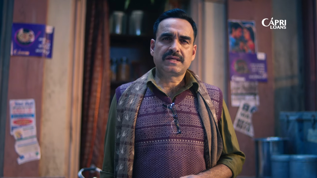
MUMBAI: Capri Loans has launched a new brand campaign, Zaroorat mein aapke saath, positioning itself as a dependable financial partner during moments of urgent need.

The campaign features actor Pankaj Tripathi as brand ambassador and centres on everyday situations where individuals struggle to access timely financial support, despite having strong personal networks. The brand film presents Capri Loans as a reassuring presence in such moments, reinforcing its promise of standing by customers when it matters most.

Rolled out across television and digital platforms, the campaign is aimed at strengthening brand awareness and recall across the company’s core markets, while building long-term brand equity. It aligns with Capri Loans’ broader brand promise, farz nibhaatey hain.

Advertisement

“Access to capital should never become a barrier to aspiration or progress,” said Capri Loans head of marketing Nishant Gehlot. “This campaign reflects real-life experiences and reinforces our role as a trusted partner in times of need.”

The campaign highlights the lender’s key offerings across MSME loans, gold loans and home loans, underlining its focus on accessibility, reliability and long-term customer relationships.

Capri Loans, the retail lending arm of Capri Global Capital Limited, is a listed non-banking financial company with assets under management of over Rs 30,000 crore as of December 31, 2025.

Advertisement
Click to comment

Leave a Reply

Your email address will not be published. Required fields are marked *

Brands

Godrej clarifies ‘GI’ identifier after logo similarity debate

Says GI is not a logo, will not replace Godrej signature across products.

Published

on

MUMBAI: In a branding storm where shapes did the talking, Godrej is now spelling things out. Godrej Industries Group (GIG) has issued a clarification on its newly introduced ‘GI’ identifier, addressing questions around its purpose and design following a wave of online criticism. At the centre of the debate were two concerns: whether the new mark replaces the long-standing Godrej logo, and whether its geometric design mirrors other corporate identities.

The company has drawn a clear line. The Godrej signature logo, it said, remains unchanged and continues to be the sole logo across all consumer-facing products and services. The ‘GI’ mark, by contrast, is not a logo but a corporate group identifier intended for use alongside the Godrej signature or company name, and aimed at stakeholders such as investors, media and talent rather than consumers.

The need for such a distinction stems from the 2024 restructuring of the broader Godrej Group into two separate business entities. With both continuing to operate under the same Godrej name and signature, the identifier is positioned as a way to differentiate the Godrej Industries Group at a corporate level.

Advertisement

The rollout, however, triggered a broader conversation on design originality. Critics pointed to similarities between the GI mark’s geometric composition and logos used by companies globally, raising questions about distinctiveness.

Responding to this, GIG said its intellectual property and legal review found that such overlaps are common in minimalist, geometry-led design systems. Basic forms such as circles and rectangles appear across dozens of brand identities worldwide, the company noted.

It added that the identifier emerged from an extensive design process and was chosen for its simplicity, allowing it to sit alongside the Godrej signature without competing visually. While acknowledging that elemental shapes may appear less distinctive in isolation, the group emphasised that the mark is part of a broader identity system that includes a custom typeface, sonic branding and other proprietary elements.

Advertisement

Following legal and ethical assessments, the company said it found no impediment to using the identifier, reiterating that the GI mark is a corporate tool not a consumer-facing symbol.

In short, the logo isn’t changing but the conversation around it certainly has.

Advertisement
Continue Reading

Advertisement News18
Advertisement
Advertisement
Advertisement
Advertisement Whtasapp
Advertisement Year Enders

Indian Television Dot Com Pvt Ltd

Signup for news and special offers!

Copyright © 2026 Indian Television Dot Com PVT LTD

This will close in 10 seconds