Brands
Cadbury 5 Star flips Valentine’s Day script with ‘one million dates’ stunt
MUMBAI: Cadbury 5 Star has ended its long-running campaign against Valentine’s Day with a playful reversal, announcing it would sponsor one million dates, before revealing the promise as a deliberate bluff rooted in its signature “Do nothing” philosophy.
The chocolate brand, known for poking fun at Valentine’s Day hype, unveiled the campaign through teaser and reveal films released on its YouTube channel. Conceived by Ogilvy India, the campaign initially claimed the brand would restore the occasion by funding research-backed Valentine’s Day itineraries inspired by the festival’s origins.
The reveal, however, delivered a twist: the so-called historical research suggested the purest way to honour the day of love was to spend it doing absolutely nothing, bringing the narrative back to Cadbury 5 Star’s irreverent brand positioning.
Mondelez India vice president – marketing Nitin Saini, said the campaign was designed to surprise audiences while reinforcing the brand’s relaxed, anti-hype stance on Valentine’s Day.
Ogilvy India chief creative officer Sukesh Kumar Nayak, said the idea took the brand in an unexpected direction by pretending to embrace romance before subverting it with humour.
The campaign is supported by a digital platform developed by Ogilvy’s creative tech team, where couples can sign up for the fictional sponsored dates.
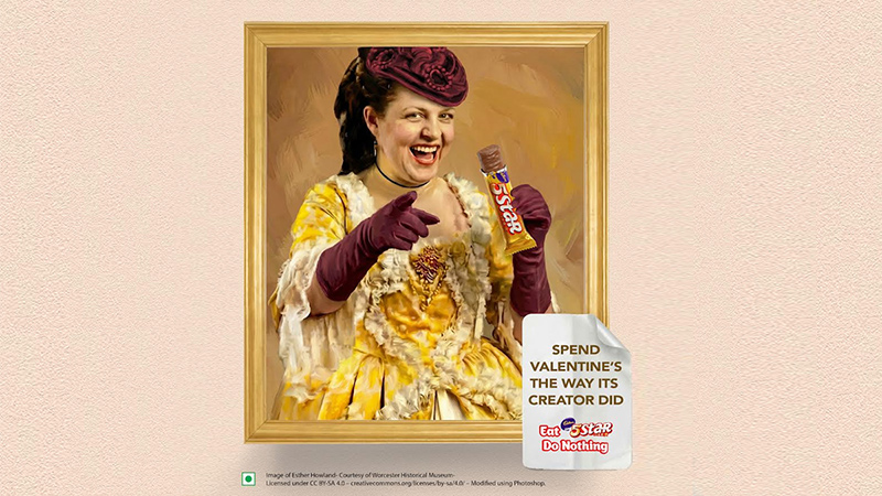
Wavemaker, which handled media strategy, introduced Esther Howland, often associated with the early commercialisation of Valentine’s cards, as a tongue-in-cheek cultural disruptor, aimed at encouraging Gen Z consumers to opt out of performative romance.
Cadbury 5 Star is part of Mondelez India Foods, which has operated in the country for over 75 years and owns brands including Cadbury Dairy Milk, Silk, Perk, Fuse, Gems, Bournvita, Oreo and Tang
Brands
Godrej clarifies ‘GI’ identifier after logo similarity debate
Says GI is not a logo, will not replace Godrej signature across products.
MUMBAI: In a branding storm where shapes did the talking, Godrej is now spelling things out. Godrej Industries Group (GIG) has issued a clarification on its newly introduced ‘GI’ identifier, addressing questions around its purpose and design following a wave of online criticism. At the centre of the debate were two concerns: whether the new mark replaces the long-standing Godrej logo, and whether its geometric design mirrors other corporate identities.
The company has drawn a clear line. The Godrej signature logo, it said, remains unchanged and continues to be the sole logo across all consumer-facing products and services. The ‘GI’ mark, by contrast, is not a logo but a corporate group identifier intended for use alongside the Godrej signature or company name, and aimed at stakeholders such as investors, media and talent rather than consumers.
The need for such a distinction stems from the 2024 restructuring of the broader Godrej Group into two separate business entities. With both continuing to operate under the same Godrej name and signature, the identifier is positioned as a way to differentiate the Godrej Industries Group at a corporate level.
The rollout, however, triggered a broader conversation on design originality. Critics pointed to similarities between the GI mark’s geometric composition and logos used by companies globally, raising questions about distinctiveness.
Responding to this, GIG said its intellectual property and legal review found that such overlaps are common in minimalist, geometry-led design systems. Basic forms such as circles and rectangles appear across dozens of brand identities worldwide, the company noted.
It added that the identifier emerged from an extensive design process and was chosen for its simplicity, allowing it to sit alongside the Godrej signature without competing visually. While acknowledging that elemental shapes may appear less distinctive in isolation, the group emphasised that the mark is part of a broader identity system that includes a custom typeface, sonic branding and other proprietary elements.
Following legal and ethical assessments, the company said it found no impediment to using the identifier, reiterating that the GI mark is a corporate tool not a consumer-facing symbol.
In short, the logo isn’t changing but the conversation around it certainly has.


