Connect with us

Brands

Burger King turns up the heat in Tirupati with new outlet on Air Bypass Road

Published

on

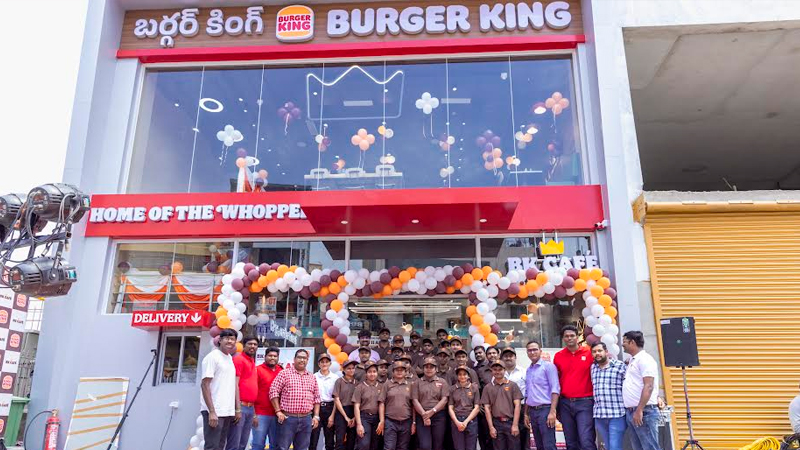
MUMBAI: Pilgrims in Tirupati just got a side of fries with their faith. Burger KingĀ® has officially flipped the switch on its first restaurant in the temple town, unveiling a swanky new outlet on Air Bypass Road. The launch marks the flame-grilled giant’s 113 store in south India, signalling its intent to serve more than just devotion in the spiritual capital.

Burger King’s entry into Tirupati drew over 100 families to its vibrant launch event, featuring traditional ribbon-cutting, festive decor and a smorgasbord of family-friendly activities. But it wasn’t just the ambience that had the crowd cheering—the real star of the show was the menu.

From the globally loved WhopperĀ® in Veg, Chicken, and Mutton variants to regional flavour bombs like Chicken Tandoori and Makhani Burst, the outlet caters to a variety of cravings. The spread also features vegetarian mainstays such as the Crispy Veg and Hot ‘n’ Saucy. For sweet finales, guests can indulge in thick shakes, Choco Lava Cake or Sundaes, while sipping on barista-style brews like Hot Chocolate and Masala Chai from the Burger King Cafe.

Advertisement

For those seeking culinary kicks, the Korean Range ups the ante. The Korean Spicy Chicken and Paneer Burgers, Korean Wings, and Korean Fries offer a bold twist that’s anything but mild. The brand continues to champion innovation and taste diversity.

Blending tech with taste, the Tirupati outlet features Self-Ordering Kiosks, QR Code Table Ordering and Table Service to keep the queues at bay and the burgers flowing. With its digital-first philosophy, Burger King is also dangling tempting offers: Two veg burgers for Rs 79 and 2 chicken burgers for Rs 99, alongside app-exclusive deals for dine-in guests.

Commenting on the new store, Burger King India CMO Kapil Grover said, ā€œTirupati is a significant location for us—not just for its cultural importance, but also for the vibrant community we’re excited to serve. With this launch, we bring Burger King’s signature taste and digital convenience to Tirupati, while staying true to our promise of quality, taste, and valueā€.

Advertisement

He added, ā€œEvery new restaurant we open brings us closer to diverse communities across India. Our focus is to deliver a memorable guest experience through taste innovation, digital-first ordering, and exceptional valueā€.

With its modern, family-friendly design and a flavour-packed menu, Burger King’s Tirupati debut delivers a wholesome bite of global appeal with local flavour.

Advertisement
Click to comment

Leave a Reply

Your email address will not be published. Required fields are marked *

Brands

Godrej clarifies ā€˜GI’ identifier after logo similarity debate

Says GI is not a logo, will not replace Godrej signature across products.

Published

on

MUMBAI: In a branding storm where shapes did the talking, Godrej is now spelling things out. Godrej Industries Group (GIG) has issued a clarification on its newly introduced ā€˜GI’ identifier, addressing questions around its purpose and design following a wave of online criticism. At the centre of the debate were two concerns: whether the new mark replaces the long-standing Godrej logo, and whether its geometric design mirrors other corporate identities.

The company has drawn a clear line. The Godrej signature logo, it said, remains unchanged and continues to be the sole logo across all consumer-facing products and services. The ā€˜GI’ mark, by contrast, is not a logo but a corporate group identifier intended for use alongside the Godrej signature or company name, and aimed at stakeholders such as investors, media and talent rather than consumers.

The need for such a distinction stems from the 2024 restructuring of the broader Godrej Group into two separate business entities. With both continuing to operate under the same Godrej name and signature, the identifier is positioned as a way to differentiate the Godrej Industries Group at a corporate level.

Advertisement

The rollout, however, triggered a broader conversation on design originality. Critics pointed to similarities between the GI mark’s geometric composition and logos used by companies globally, raising questions about distinctiveness.

Responding to this, GIG said its intellectual property and legal review found that such overlaps are common in minimalist, geometry-led design systems. Basic forms such as circles and rectangles appear across dozens of brand identities worldwide, the company noted.

It added that the identifier emerged from an extensive design process and was chosen for its simplicity, allowing it to sit alongside the Godrej signature without competing visually. While acknowledging that elemental shapes may appear less distinctive in isolation, the group emphasised that the mark is part of a broader identity system that includes a custom typeface, sonic branding and other proprietary elements.

Advertisement

Following legal and ethical assessments, the company said it found no impediment to using the identifier, reiterating that the GI mark is a corporate tool not a consumer-facing symbol.

In short, the logo isn’t changing but the conversation around it certainly has.

Advertisement
Continue Reading

Advertisement News18
Advertisement
Advertisement
Advertisement
Advertisement Whtasapp
Advertisement Year Enders

Indian Television Dot Com Pvt Ltd

Signup for news and special offers!

Copyright Ā© 2026 Indian Television Dot Com PVT LTD

This will close in 10 seconds