Brands
Blenders Pride Fashion Tour enters the Futureverse
MUMBAI: Step aside, the runway just got a reboot. Blenders Pride Fashion Tour kicked off its Gurugram edition, plunging fashion into the Futureverse, where couture meets code and the audience doesn’t just watch, it experiences.
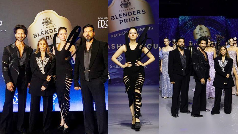
The showcase, themed Fashion’s Next Move, transformed the runway into an interactive universe. From Tamannaah Bhatia sharing the stage with humanoid robots to Shahid Kapoor’s holographic showstopper, every moment blurred the line between reality and digital spectacle. Motion-sensing visuals followed every step of the models, while dynamic projections stitched the story together, making fashion not just seen, but felt.
Designers Falguni and Shane Peacock, in collaboration with the Fashion Design Council of India, delivered futuristic silhouettes that reflected a global, forward-thinking vision. The Gurugram edition highlighted the cultural shift in fashion, where audiences crave immersion as much as elegance.
Pernod Ricard India CMO Debasree Dasgupta said, “We’ve taken a bold step into the Futureverse of fashion, creating an immersive experience where technology and style coexist seamlessly. It inspires the next generation to see fashion as a living, evolving expression of identity and innovation.”
Designers Falguni and Shane Peacock added, “Blenders Pride Fashion Tour has always pushed creative boundaries. This edition shapes a new narrative where innovation and creativity define the next era of style.”
FDCI chairman Sunil Sethi, praised the collaboration, noting that the Gurugram showcase celebrates creativity and sets the pace for Indian fashion’s future. Shahid Kapoor and Tamannaah Bhatia shared their excitement, calling the blend of high fashion and technology electrifying and a glimpse into the next evolution of the industry.
The tour now heads to Jaipur, where designers Abhishek Patni and Namrata Joshipura will present high-octane couture alongside miss universe Harnaaz Sandhu and rapper Raftaar on December 6. Fashion, it seems, is not just moving forward, it’s leaping into a digital dimension.
Brands
Godrej clarifies ‘GI’ identifier after logo similarity debate
Says GI is not a logo, will not replace Godrej signature across products.
MUMBAI: In a branding storm where shapes did the talking, Godrej is now spelling things out. Godrej Industries Group (GIG) has issued a clarification on its newly introduced ‘GI’ identifier, addressing questions around its purpose and design following a wave of online criticism. At the centre of the debate were two concerns: whether the new mark replaces the long-standing Godrej logo, and whether its geometric design mirrors other corporate identities.
The company has drawn a clear line. The Godrej signature logo, it said, remains unchanged and continues to be the sole logo across all consumer-facing products and services. The ‘GI’ mark, by contrast, is not a logo but a corporate group identifier intended for use alongside the Godrej signature or company name, and aimed at stakeholders such as investors, media and talent rather than consumers.
The need for such a distinction stems from the 2024 restructuring of the broader Godrej Group into two separate business entities. With both continuing to operate under the same Godrej name and signature, the identifier is positioned as a way to differentiate the Godrej Industries Group at a corporate level.
The rollout, however, triggered a broader conversation on design originality. Critics pointed to similarities between the GI mark’s geometric composition and logos used by companies globally, raising questions about distinctiveness.
Responding to this, GIG said its intellectual property and legal review found that such overlaps are common in minimalist, geometry-led design systems. Basic forms such as circles and rectangles appear across dozens of brand identities worldwide, the company noted.
It added that the identifier emerged from an extensive design process and was chosen for its simplicity, allowing it to sit alongside the Godrej signature without competing visually. While acknowledging that elemental shapes may appear less distinctive in isolation, the group emphasised that the mark is part of a broader identity system that includes a custom typeface, sonic branding and other proprietary elements.
Following legal and ethical assessments, the company said it found no impediment to using the identifier, reiterating that the GI mark is a corporate tool not a consumer-facing symbol.
In short, the logo isn’t changing but the conversation around it certainly has.


