Connect with us

Brands

Bags of cheer Marriott Bonvoy unwraps Christmas at Mumbai airport

Published

on

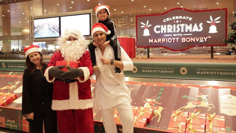
MUMBAI: Christmas came rolling in on the baggage belt at Marriott Bonvoy, as the hospitality brand transformed arrivals at Mumbai International Airport Terminal 2 into an unexpected festive celebration.

During the peak holiday travel period, passengers stepping into Terminal 2 were greeted with a reimagined arrivals conveyor belt delivering personalised Christmas hampers. Each gift was tagged with the traveller’s seat number, adding a thoughtful, individual touch that turned a functional airport moment into something far more personal and joyful.

The experience was brought to life with brand ushers guiding guests through the activation, a live Christmas choir filling the space with seasonal music, and Santa Claus himself making appearances for cheerful meet-and-greets. What is usually a hurried, forgettable arrival became a moment of pause, delight and festive warmth.

Advertisement

The activation reflected Marriott Bonvoy’s belief that hospitality extends beyond hotel lobbies and destinations, beginning the moment a journey ends. By reimagining a familiar travel touchpoint, the brand leaned into the spirit of giving and emotional connection that defines the Christmas season.

Actor and digital creator Namrata Seth, who experienced the activation first-hand, said the surprise added an instant sense of celebration to her arrival, turning the conveyor belt into a joyful reminder that the festive spirit can show up in the most unexpected places.

The airport experience also tied into Marriott Bonvoy’s wider festive offering. Its Celebrate Christmas with Marriott Bonvoy collection features handcrafted cakes, cookies, hampers and DIY treats curated by culinary teams across participating Marriott hotels in India, extending the same sense of care and craftsmanship into homes and gatherings throughout the season.

Advertisement

With this Christmas activation, Marriott Bonvoy once again demonstrated how everyday moments can be transformed into memorable experiences, reinforcing its focus on celebrating journeys as much as the destinations they lead to.

Click to comment

Leave a Reply

Your email address will not be published. Required fields are marked *

Brands

Godrej clarifies ‘GI’ identifier after logo similarity debate

Says GI is not a logo, will not replace Godrej signature across products.

Published

on

MUMBAI: In a branding storm where shapes did the talking, Godrej is now spelling things out. Godrej Industries Group (GIG) has issued a clarification on its newly introduced ‘GI’ identifier, addressing questions around its purpose and design following a wave of online criticism. At the centre of the debate were two concerns: whether the new mark replaces the long-standing Godrej logo, and whether its geometric design mirrors other corporate identities.

The company has drawn a clear line. The Godrej signature logo, it said, remains unchanged and continues to be the sole logo across all consumer-facing products and services. The ‘GI’ mark, by contrast, is not a logo but a corporate group identifier intended for use alongside the Godrej signature or company name, and aimed at stakeholders such as investors, media and talent rather than consumers.

The need for such a distinction stems from the 2024 restructuring of the broader Godrej Group into two separate business entities. With both continuing to operate under the same Godrej name and signature, the identifier is positioned as a way to differentiate the Godrej Industries Group at a corporate level.

Advertisement

The rollout, however, triggered a broader conversation on design originality. Critics pointed to similarities between the GI mark’s geometric composition and logos used by companies globally, raising questions about distinctiveness.

Responding to this, GIG said its intellectual property and legal review found that such overlaps are common in minimalist, geometry-led design systems. Basic forms such as circles and rectangles appear across dozens of brand identities worldwide, the company noted.

It added that the identifier emerged from an extensive design process and was chosen for its simplicity, allowing it to sit alongside the Godrej signature without competing visually. While acknowledging that elemental shapes may appear less distinctive in isolation, the group emphasised that the mark is part of a broader identity system that includes a custom typeface, sonic branding and other proprietary elements.

Advertisement

Following legal and ethical assessments, the company said it found no impediment to using the identifier, reiterating that the GI mark is a corporate tool not a consumer-facing symbol.

In short, the logo isn’t changing but the conversation around it certainly has.

Advertisement
Continue Reading

Advertisement News18
Advertisement
Advertisement
Advertisement
Advertisement Whtasapp
Advertisement Year Enders

Indian Television Dot Com Pvt Ltd

Signup for news and special offers!

Copyright © 2026 Indian Television Dot Com PVT LTD

This will close in 10 seconds