Brands
Aston Martin revs up its watch collection for India debut
Delhi: Aston Martin has shifted gears from road to wrist, unveiling its first-ever watch collection in India. Developed with Timex Group, the line translates the marque’s high-octane design DNA into timepieces that fuse precision engineering with effortless style.
The launch was teased at an exclusive preview in Delhi, hosted for India’s leading lifestyle and luxury media, ahead of a commercial rollout at premium Timex Group outlets such as Just Watches, as well as select high-end retailers across the country.
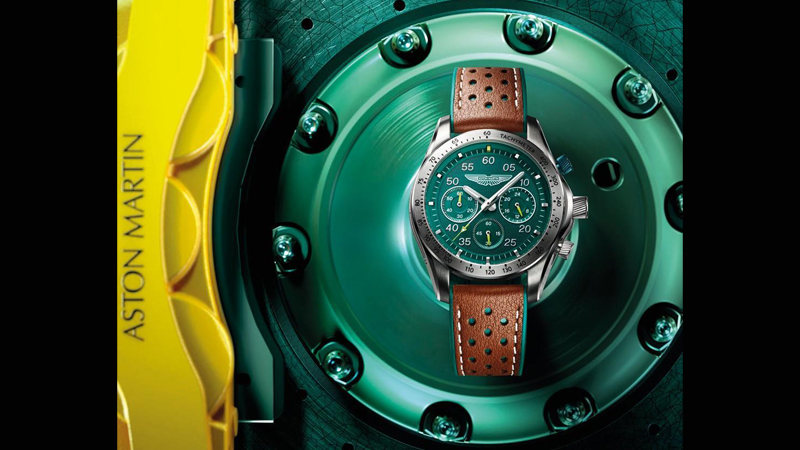
The collection splits into two distinct tracks, Timeless, a nod to vintage heritage, and Icon, a sleek contemporary line for modern luxury seekers. Signature materials, titanium, carbon fibre, and silicone, echo Aston Martin’s automotive craftsmanship, while details like wheel-rim dials and stitching inspired by car interiors make the connection between watch and car immediate and visceral.
At the forefront is the TRG Automatic, a skeleton-dial marvel powered by a Japanese automatic movement and housed in a lightweight titanium tonneau case. Carbon-fibre flanks and performance-textured straps echo the precision and power of Aston Martin’s engineering.
Designed and manufactured by Timex Group, the collection marries British luxury with global craft expertise. Prices in India range from Rs 17,995 to Rs 57,995, with availability at Just Watches, Justwatches.com, and key retailers including Shoppers Stop, The Collective, Kamal Watches, Zimson Watches, Swiss Time House, Sethi Watch Company and Ganga Ram Gallery.
“Premium, design-led timepieces are booming in India. This collaboration with Aston Martin lets us deliver exceptional craftsmanship and innovation to discerning consumers,” said Deepak Chhabra, managing director, Timex Group India.
“This collection distils Aston Martin’s artistry and performance into a wearable form. It’s for those who drive the extraordinary every day,” said director of brand diversification, Aston Martin, Stefano Saporetti.
The collection is more than a wrist accessory, it’s an adrenaline rush in miniature, a reminder that Aston Martin’s spirit isn’t confined to the tarmac. Fasten your seatbelts.
Brands
Godrej clarifies ‘GI’ identifier after logo similarity debate
Says GI is not a logo, will not replace Godrej signature across products.
MUMBAI: In a branding storm where shapes did the talking, Godrej is now spelling things out. Godrej Industries Group (GIG) has issued a clarification on its newly introduced ‘GI’ identifier, addressing questions around its purpose and design following a wave of online criticism. At the centre of the debate were two concerns: whether the new mark replaces the long-standing Godrej logo, and whether its geometric design mirrors other corporate identities.
The company has drawn a clear line. The Godrej signature logo, it said, remains unchanged and continues to be the sole logo across all consumer-facing products and services. The ‘GI’ mark, by contrast, is not a logo but a corporate group identifier intended for use alongside the Godrej signature or company name, and aimed at stakeholders such as investors, media and talent rather than consumers.
The need for such a distinction stems from the 2024 restructuring of the broader Godrej Group into two separate business entities. With both continuing to operate under the same Godrej name and signature, the identifier is positioned as a way to differentiate the Godrej Industries Group at a corporate level.
The rollout, however, triggered a broader conversation on design originality. Critics pointed to similarities between the GI mark’s geometric composition and logos used by companies globally, raising questions about distinctiveness.
Responding to this, GIG said its intellectual property and legal review found that such overlaps are common in minimalist, geometry-led design systems. Basic forms such as circles and rectangles appear across dozens of brand identities worldwide, the company noted.
It added that the identifier emerged from an extensive design process and was chosen for its simplicity, allowing it to sit alongside the Godrej signature without competing visually. While acknowledging that elemental shapes may appear less distinctive in isolation, the group emphasised that the mark is part of a broader identity system that includes a custom typeface, sonic branding and other proprietary elements.
Following legal and ethical assessments, the company said it found no impediment to using the identifier, reiterating that the GI mark is a corporate tool not a consumer-facing symbol.
In short, the logo isn’t changing but the conversation around it certainly has.


