Brands
Asics brings back the Gel-Kayano 12.1 in style
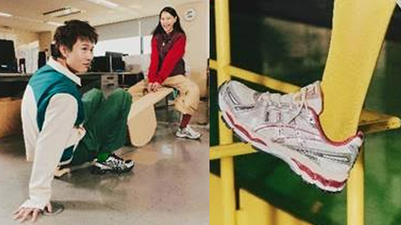
MUMBAI: Asics SportStyle has revived the iconic Gel-Kayano 12.1, a cult favourite from the mid-2000s, in collaboration with long-time partner Kith. The reissue keeps its vintage heart but gets a modern lift, blending nostalgic design with next-gen comfort.
The shoe’s upper nods to the original Gel-Kayano 12, famously inspired by European gothic armour. Think sleek metallic overlays, breathable mesh panels and that unmistakable Asics silhouette, now tuned for daily wear. A special touch lies in the tongue, which features Japanese kanji characters for “Kayano,” a tribute to designer Toshikazu Kayano, who shaped the franchise from 1993 to 2007.
Underfoot, the Gel-Kayano 12.1 swaps the track for the street with the Gel-Nimbus 17’s midsole technology. Its fluid ride system, built from Flytefoam and Ff Blast cushioning, keeps every step light, responsive and ridiculously comfortable. Gel inserts in the heel and forefoot round it off with plush impact absorption that feels as good as it looks.
“We’ve seen incredible growth in the SportsStyle category in India,” said Asics India & South Asia managing director Rajat Khurana. “The revival of vintage tech has allowed us to reimagine icons like the Gel-Kayano 12.1 for a new generation that values both performance and style.”
The Gel-Kayano 12.1 is more than a sneaker comeback, it’s a stylish stride through Asics’ heritage, proving that great design never really goes out of step.
Brands
Godrej clarifies ‘GI’ identifier after logo similarity debate
Says GI is not a logo, will not replace Godrej signature across products.
MUMBAI: In a branding storm where shapes did the talking, Godrej is now spelling things out. Godrej Industries Group (GIG) has issued a clarification on its newly introduced ‘GI’ identifier, addressing questions around its purpose and design following a wave of online criticism. At the centre of the debate were two concerns: whether the new mark replaces the long-standing Godrej logo, and whether its geometric design mirrors other corporate identities.
The company has drawn a clear line. The Godrej signature logo, it said, remains unchanged and continues to be the sole logo across all consumer-facing products and services. The ‘GI’ mark, by contrast, is not a logo but a corporate group identifier intended for use alongside the Godrej signature or company name, and aimed at stakeholders such as investors, media and talent rather than consumers.
The need for such a distinction stems from the 2024 restructuring of the broader Godrej Group into two separate business entities. With both continuing to operate under the same Godrej name and signature, the identifier is positioned as a way to differentiate the Godrej Industries Group at a corporate level.
The rollout, however, triggered a broader conversation on design originality. Critics pointed to similarities between the GI mark’s geometric composition and logos used by companies globally, raising questions about distinctiveness.
Responding to this, GIG said its intellectual property and legal review found that such overlaps are common in minimalist, geometry-led design systems. Basic forms such as circles and rectangles appear across dozens of brand identities worldwide, the company noted.
It added that the identifier emerged from an extensive design process and was chosen for its simplicity, allowing it to sit alongside the Godrej signature without competing visually. While acknowledging that elemental shapes may appear less distinctive in isolation, the group emphasised that the mark is part of a broader identity system that includes a custom typeface, sonic branding and other proprietary elements.
Following legal and ethical assessments, the company said it found no impediment to using the identifier, reiterating that the GI mark is a corporate tool not a consumer-facing symbol.
In short, the logo isn’t changing but the conversation around it certainly has.


