Brands
Archies-Magicpin partner to expand gifting to digital-savvy audience

MUMBAI: They have gifted a magical relationship to each other. Gifting and social expression company Archies has partnered with hyperlocal discovery, delivery and savings platform Magicpin to create a seamless and impactful gifting experience. This collaboration leverages Archies’ legacy of thoughtful gifting with Magicpin’s robust digital ecosystem, targeting a wider, tech-savvy audience.
Archies, with over 45 years of expertise in offering greeting cards, photo albums, perfumes, stuffed toys, and more, operates 325 exclusive outlets across 15 states and 66 cities. The brand has consistently evolved with modern culture and urbanisation, becoming synonymous with sentiment-driven gifting.
Magicpin, with a user base exceeding 10 million across 20 cities, connects consumers with 275,000 plus retailers and 3,000 plus brands across categories such as food, fashion, and entertainment. It processes over $3 billion in annual spending, offering substantial savings and rewards to its members.

The collaboration aims to expand Archies reach among Magicpin’s digitally-savvy audience as well as enhance value for the latter which will be enriching its offerings for high-intent shoppers by adding a gifting option to its platform. .
Archies executive director Varun Moolchandani said: “This collaboration allows us to engage with a dynamic audience, enhancing their gifting journey with our innovative offerings.”
Magicpin, CXO of enterprise brands Naman Mawandia, highlighted the mutual benefits: “Our partnership with Archies reinforces our commitment to empowering businesses and customers. We are excited to offer additional savings to our users while helping Archies connect with a broader customer base.”
The collaboration will feature seasonal campaigns and promotional activities to maximize impact during peak
gifting periods. Both brands aim to redefine the gifting experience by merging Archies’ expertise with Magicpin’s tech-driven marketing. Success will be measured through key performance indicators such as sales growth, customer engagement, and repeat purchases.


Brands
Godrej clarifies ‘GI’ identifier after logo similarity debate
Says GI is not a logo, will not replace Godrej signature across products.
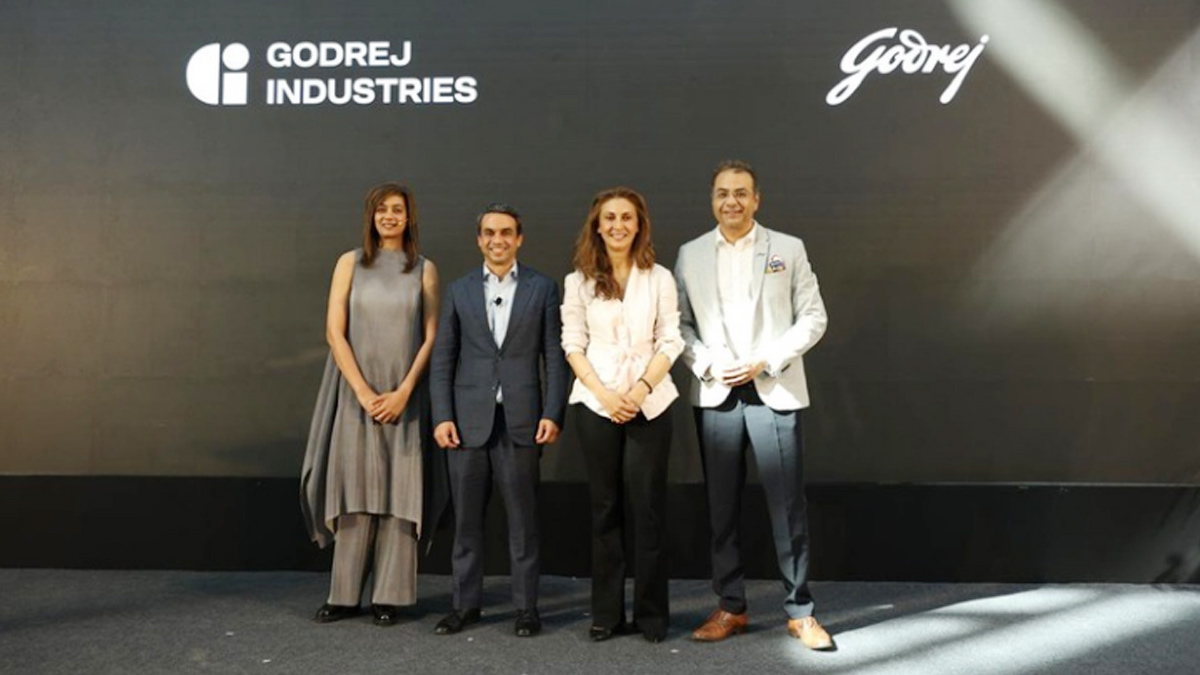
MUMBAI: In a branding storm where shapes did the talking, Godrej is now spelling things out. Godrej Industries Group (GIG) has issued a clarification on its newly introduced ‘GI’ identifier, addressing questions around its purpose and design following a wave of online criticism. At the centre of the debate were two concerns: whether the new mark replaces the long-standing Godrej logo, and whether its geometric design mirrors other corporate identities.
The company has drawn a clear line. The Godrej signature logo, it said, remains unchanged and continues to be the sole logo across all consumer-facing products and services. The ‘GI’ mark, by contrast, is not a logo but a corporate group identifier intended for use alongside the Godrej signature or company name, and aimed at stakeholders such as investors, media and talent rather than consumers.
The need for such a distinction stems from the 2024 restructuring of the broader Godrej Group into two separate business entities. With both continuing to operate under the same Godrej name and signature, the identifier is positioned as a way to differentiate the Godrej Industries Group at a corporate level.
The rollout, however, triggered a broader conversation on design originality. Critics pointed to similarities between the GI mark’s geometric composition and logos used by companies globally, raising questions about distinctiveness.
Responding to this, GIG said its intellectual property and legal review found that such overlaps are common in minimalist, geometry-led design systems. Basic forms such as circles and rectangles appear across dozens of brand identities worldwide, the company noted.
It added that the identifier emerged from an extensive design process and was chosen for its simplicity, allowing it to sit alongside the Godrej signature without competing visually. While acknowledging that elemental shapes may appear less distinctive in isolation, the group emphasised that the mark is part of a broader identity system that includes a custom typeface, sonic branding and other proprietary elements.
Following legal and ethical assessments, the company said it found no impediment to using the identifier, reiterating that the GI mark is a corporate tool not a consumer-facing symbol.
In short, the logo isn’t changing but the conversation around it certainly has.