Brands
Apple turns 50: half a century of thinking different
From a Californian garage to a global giant, the Cupertino company reflects on five dizzyingly creative decades
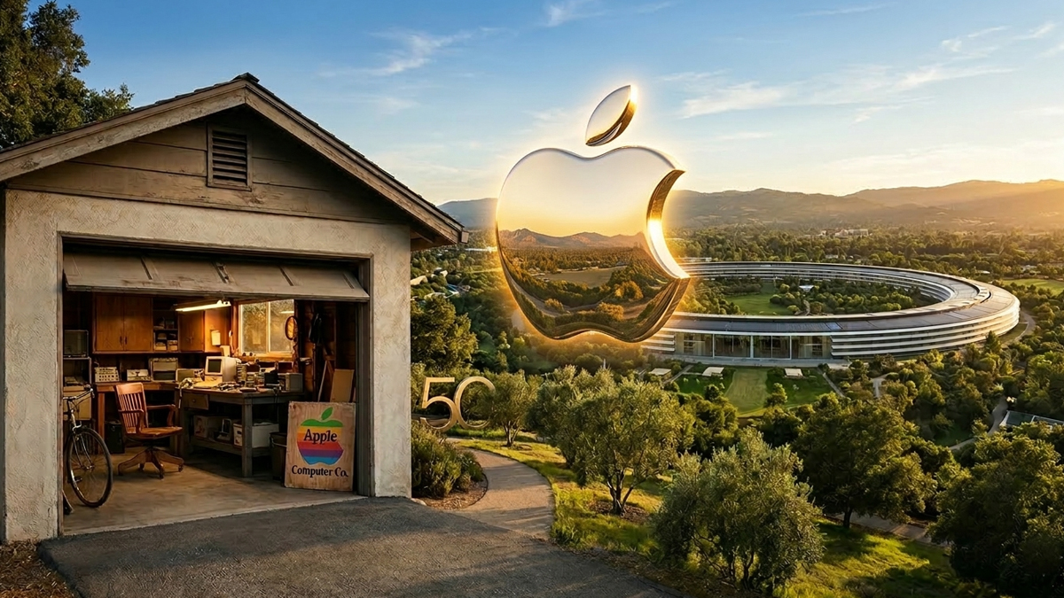
CALIFORNIA: It began in a garage. It ends, fifty years later, as one of the most valuable companies on earth. Apple is turning 50, and if that sounds like a midlife crisis waiting to happen, the Cupertino firm is having absolutely none of it.
Founded on 1 April 1976 by Steve Jobs, Steve Wozniak, and Ronald Wayne, Apple has marked its golden anniversary with a letter from chief executive Tim Cook and a promise to keep doing what it has always done: irritate the status quo until something brilliant falls out.
The company announced it will spend the coming weeks celebrating its milestone with its global community of customers, developers, and employees, reflecting on the products and ideas that have, over five restless decades, managed to reshape entire industries.
And what a list of reshaping it is. The Apple II brought the personal computer into living rooms. The Macintosh made it loveable. The iPod put a thousand songs in your pocket and made the music industry very nervous indeed. Then came the iPhone, which did to mobile phones what the Mac had done to computing, and changed daily life so thoroughly that it is now difficult to remember what boredom felt like. The iPad, Apple Watch, AirPods, and Apple Vision Pro followed, each one arriving with the same quiet confidence that it was, obviously, the future.
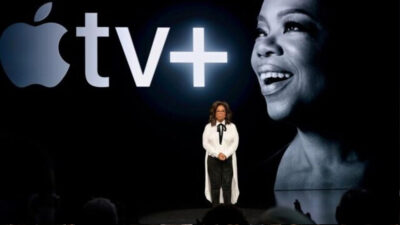
The services have quietly become just as essential. The App Store, Apple Music, iCloud, Apple Pay, and Apple TV now form the digital scaffolding of millions of daily routines, the kind of infrastructure you only notice when it is gone.
In his anniversary letter, Cook struck a deliberately human note, steering away from the language of market caps and quarterly earnings. The most meaningful chapters, he wrote, are written not by Apple but by the people who use its technology. The nurse who kept in touch with patients. The parent who caught their toddler’s first steps on an iPhone. The writer who finished the book. The runner who crossed the finish line.
“In your hands, the tools we make have improved lives, and sometimes even saved them,” Cook wrote, in one of the letter’s more striking lines. It is a bold claim, though not an unfounded one, given Apple Watch’s now well-documented history of detecting irregular heart rhythms and alerting wearers who had no idea anything was wrong.
Cook, who has led the company since Jobs stepped down in 2011, was careful to credit everyone except himself. The letter thanks Apple’s global teams, its developer community, and the millions of customers who have been, in the company’s preferred parlance, thinking different alongside them.
The anniversary announcement also offered a quiet signal about Apple’s current preoccupations. Alongside the expected nods to privacy and environmental responsibility, Cook specifically mentioned Apple Intelligence, the company’s on-device artificial intelligence platform, as a sign of where the next chapter is headed. If the past fifty years were about putting powerful tools in people’s hands, the next chapter appears to be about making those tools think.
The letter closes with a passage lifted, with only a small tweak, from the original 1997 “Think Different” advertisement, that famous roll-call of the misfits, the rebels, and the round pegs in square holes. It remains, even now, one of the most effective pieces of brand storytelling ever written. Whether it still fits a company with a two-trillion-pound valuation is a question Apple is presumably choosing not to ask itself on its birthday.
Celebrations are expected to continue through the spring, with details to be announced in the coming weeks. For now, the garage in Los Altos, California, where it all began, remains a modest historical footnote. The company it spawned is anything but.