Connect with us

Brands

Anor leads the shift to premium grown diamonds in bridal wear

Published

on

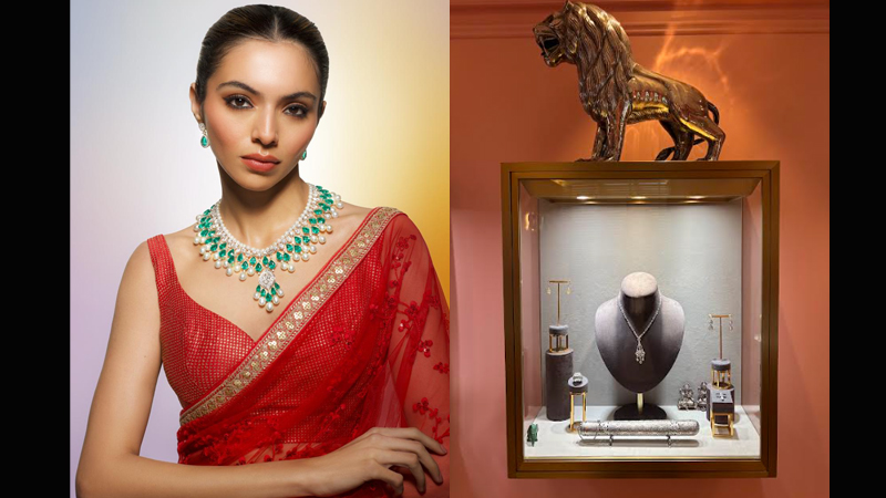
MUMBAI: A quiet but decisive shift is reshaping India’s bridal jewellery market. Today’s brides are rethinking what luxury means and many are choosing premium grown diamonds over traditional mined stones. At the heart of this change is Anor, a brand that has staked its claim with a registered trademark on its premium grown diamond.

Once seen as a niche alternative, grown diamonds are now stepping confidently into the spotlight of bridal and occasion jewellery. For the modern bride, a diamond is no longer just a symbol of tradition. It reflects personal values, informed choices and a desire for balance. With weddings becoming more experiential, many couples are dividing their budgets between destination celebrations, couture and jewellery, without compromising on quality or elegance.

For decades, mined diamonds dominated the language of love and commitment. But rising awareness around sustainability, transparency and value has prompted a rethink. Premium grown diamonds offer the same grading standards as mined stones, while aligning with the expectations of a generation that values both ethics and excellence. Anor has positioned itself precisely at this intersection, bringing grown diamonds into the realm of fine jewellery.

Advertisement

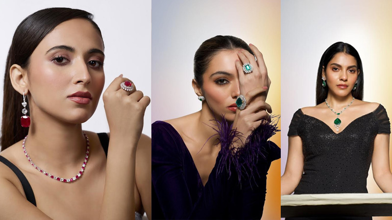
Quality remains the cornerstone. Experts agree that cut determines a diamond’s brilliance, and Anor uses advanced cutting techniques to maximise fire and sparkle. High clarity stones are carefully selected and subjected to rigorous checks, resulting in a cleaner, more refined appearance. Craftsmanship completes the equation. Each Anor piece is handmade by skilled artisans, with meticulous attention to setting, proportion and finish.

While grown diamonds have gained popularity for their ethical appeal, few brands have elevated them to true luxury standards. Anor bridges this gap by pairing premium stones with fine jewellery craftsmanship. The result is jewellery that mirrors traditional high-end pieces while offering a modern, forward-looking alternative.

When worn, an Anor diamond comes alive with light, shifting effortlessly between sparkle and subtle drama. For today’s bride, it is not just jewellery. It is a statement that modern luxury can shine with both meaning and beauty.

Advertisement
Click to comment

Leave a Reply

Your email address will not be published. Required fields are marked *

Brands

Godrej clarifies ‘GI’ identifier after logo similarity debate

Says GI is not a logo, will not replace Godrej signature across products.

Published

on

MUMBAI: In a branding storm where shapes did the talking, Godrej is now spelling things out. Godrej Industries Group (GIG) has issued a clarification on its newly introduced ‘GI’ identifier, addressing questions around its purpose and design following a wave of online criticism. At the centre of the debate were two concerns: whether the new mark replaces the long-standing Godrej logo, and whether its geometric design mirrors other corporate identities.

The company has drawn a clear line. The Godrej signature logo, it said, remains unchanged and continues to be the sole logo across all consumer-facing products and services. The ‘GI’ mark, by contrast, is not a logo but a corporate group identifier intended for use alongside the Godrej signature or company name, and aimed at stakeholders such as investors, media and talent rather than consumers.

The need for such a distinction stems from the 2024 restructuring of the broader Godrej Group into two separate business entities. With both continuing to operate under the same Godrej name and signature, the identifier is positioned as a way to differentiate the Godrej Industries Group at a corporate level.

Advertisement

The rollout, however, triggered a broader conversation on design originality. Critics pointed to similarities between the GI mark’s geometric composition and logos used by companies globally, raising questions about distinctiveness.

Responding to this, GIG said its intellectual property and legal review found that such overlaps are common in minimalist, geometry-led design systems. Basic forms such as circles and rectangles appear across dozens of brand identities worldwide, the company noted.

It added that the identifier emerged from an extensive design process and was chosen for its simplicity, allowing it to sit alongside the Godrej signature without competing visually. While acknowledging that elemental shapes may appear less distinctive in isolation, the group emphasised that the mark is part of a broader identity system that includes a custom typeface, sonic branding and other proprietary elements.

Advertisement

Following legal and ethical assessments, the company said it found no impediment to using the identifier, reiterating that the GI mark is a corporate tool not a consumer-facing symbol.

In short, the logo isn’t changing but the conversation around it certainly has.

Advertisement
Continue Reading

Advertisement News18
Advertisement
Advertisement
Advertisement
Advertisement Whtasapp
Advertisement Year Enders

Indian Television Dot Com Pvt Ltd

Signup for news and special offers!

Copyright © 2026 Indian Television Dot Com PVT LTD

This will close in 10 seconds