Brands
Andrea Mallard exits Pinterest after eight-year marketing makeover
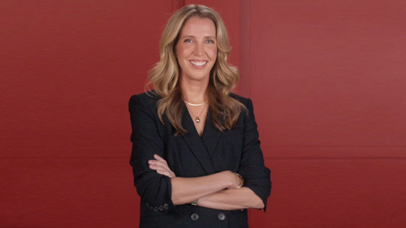
SAN FRANCISCO: Andrea Mallard, the global chief marketing officer who helped turn Pinterest into one of Silicon Valley’s most distinctive brands, has stepped down after nearly eight years at the company.
Joining Pinterest in November 2018, Mallard oversaw one of the most expansive marketing remits in big tech. She led a 600-plus strong global team spanning product, design, research, growth, communications and creative, backed by a nine-figure budget. The brief was simple in theory and complex in practice: make Pinterest indispensable to users and irresistible to advertisers.
Under her watch, Pinterest sharpened its positioning as a platform where inspiration meets intent. Campaigns blended cultural flair with commercial purpose, from advertiser outreach inspired by Alfred Hitchcock’s cinematic style to festive creative collaborations that saw Pinterest invited to decorate the White House for Christmas. One of its B2B campaigns even earned an Editor’s Pick for best marketing work, a rare feat in a crowded category.
Mallard’s influence extended beyond campaigns. She helped knit together product innovation and brand storytelling, ensuring that marketing was not a megaphone at the end of the process but a voice at the table from the start. The result was a brand that felt warmer, clearer and more human, even as the business scaled.
Her impact did not go unnoticed. In 2024, Forbes ranked her number 15 on its World’s Most Influential CMOs list, placing her among the elite global marketers shaping modern brand thinking.
Before Pinterest, Mallard served as chief marketing officer at Athleta, where she drove double-digit growth and helped steer the brand towards B Corp status. Earlier roles included CMO at Omada Health, senior leadership positions at IDEO, and formative years at Forbes and Rodale, where she was part of the team that launched Women’s Health magazine into a global phenomenon.
Alongside her executive career, Mallard sits on the boards of Kajabi, Hydrow and TwentyFirstCenturyBrand, reflecting her continued interest in creator economies, connected fitness and purpose-led growth.
As she steps away from Pinterest, Mallard leaves behind more than metrics and campaigns. She exits having helped define how a digital platform can be commercially sharp without losing its soul, no small achievement in today’s attention economy. What comes next is yet to be announced, but few would bet against it being influential, inventive and unmistakably on brand.