Brands
A century of sweetness as Hershey’s syrup hits the hundred mark
MUMBAI: It’s not every day a kitchen staple hits a century and does it with this much flair. As Hershey’s Syrup gears up to celebrate its 100th birthday in 2026, Hershey India is whisking up a full-year celebration that’s more indulgent than a triple-chocolate sundae.
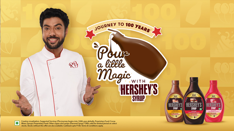
Titled Pour a Little Magic With Hershey’s Syrup, the campaign is a gooey blend of nostalgia, creativity and community love headlined by longtime brand ambassador and culinary charmer chef Ranveer Brar. The festivities kicked off with a teaser that had Brar’s fans seeing the number “100” pop up in oddly sweet places, sparking curiosity like a mystery mousse.
The syrupy surprise was soon revealed: a centenary celebration that invites consumers to join the fun by submitting their coolest, quirkiest summer recipes using the iconic chocolate syrup. Milkshakes, popsicles, desserts, you name it top 100 entries win a limited-edition recipe book co-created (and signed) by chef Brar himself, plus a chance to be featured on Hershey’s official Instagram page.
Hershey India is going full swirl with the commemorative fun, launching a digital-first campaign, a 100-year promo pack, and in-store activations to sweeten the deal. And if that’s not enough, there’s more cooking in the second half of the year expect more sugar-fuelled activities aimed at fans with a sweet tooth and a creative streak.
Commenting on the campaign Hershey India & APAC, marketing director, Kamy Devaguptapu said, “As we celebrate 100 years of Hersey’s Syrup, we are reminded of the countless moments of joy and creativity the brand has inspired across the world. This campaign is a tribute to our loyal consumers who have made Hersey’s Syrup a beloved part of their lives.”
Chef Ranveer Brar said, “Hershey’s Syrup is more than just an ingredient, it’s been part of countless memories and sweet moments in kitchens across the country. This campaign is a wonderful opportunity to showcase people’s culinary creativity by reimagining summer with Hersey’s Syrup. We invite you to share your unique recipes and inspire others with the magic of Hersey’s Syrup.”
As the syrup turns 100, it seems the recipe is simple, one part nostalgia, one part innovation, and a generous pour of magic. Ready, set, swirl.
Would you like alternative headline or subheading options as well?
Brands
Godrej clarifies ‘GI’ identifier after logo similarity debate
Says GI is not a logo, will not replace Godrej signature across products.
MUMBAI: In a branding storm where shapes did the talking, Godrej is now spelling things out. Godrej Industries Group (GIG) has issued a clarification on its newly introduced ‘GI’ identifier, addressing questions around its purpose and design following a wave of online criticism. At the centre of the debate were two concerns: whether the new mark replaces the long-standing Godrej logo, and whether its geometric design mirrors other corporate identities.
The company has drawn a clear line. The Godrej signature logo, it said, remains unchanged and continues to be the sole logo across all consumer-facing products and services. The ‘GI’ mark, by contrast, is not a logo but a corporate group identifier intended for use alongside the Godrej signature or company name, and aimed at stakeholders such as investors, media and talent rather than consumers.
The need for such a distinction stems from the 2024 restructuring of the broader Godrej Group into two separate business entities. With both continuing to operate under the same Godrej name and signature, the identifier is positioned as a way to differentiate the Godrej Industries Group at a corporate level.
The rollout, however, triggered a broader conversation on design originality. Critics pointed to similarities between the GI mark’s geometric composition and logos used by companies globally, raising questions about distinctiveness.
Responding to this, GIG said its intellectual property and legal review found that such overlaps are common in minimalist, geometry-led design systems. Basic forms such as circles and rectangles appear across dozens of brand identities worldwide, the company noted.
It added that the identifier emerged from an extensive design process and was chosen for its simplicity, allowing it to sit alongside the Godrej signature without competing visually. While acknowledging that elemental shapes may appear less distinctive in isolation, the group emphasised that the mark is part of a broader identity system that includes a custom typeface, sonic branding and other proprietary elements.
Following legal and ethical assessments, the company said it found no impediment to using the identifier, reiterating that the GI mark is a corporate tool not a consumer-facing symbol.
In short, the logo isn’t changing but the conversation around it certainly has.


