Brands
Amorepacific turns 80, marks milestone with mega celebration
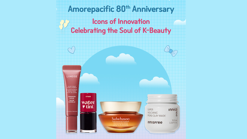
MUMBAI: Glow-rious at 80! It’s not every day a beauty giant hits the big 8-0 but when it does, it glows big. Amorepacific, the South Korean powerhouse behind cult-favourite brands like Laneige, Innisfree, Etude and Sulwhasoo, is celebrating 80 radiant years with the launch of Amorepacific Day: a three-day K-beauty carnival from 5-7 September 2025.
For the first time ever, this celebratory splash is going live across all major beauty platforms such as Nykaa, Sephora, Tira, Myntra, Amazon plus offline stores nationwide. Shoppers can snag up to 30 per cent off on bestselling skincare icons and makeup must-haves from Amorepacific’s legendary labels.
“Turning 80 is not just about looking back, it’s about celebrating the beauty we’ve built together,” said Amorepacific India, managing director & country head, Paul Lee.
With Laneige’s water sleeping mask and Sulwhasoo’s first care activating serum, Amorepacific has been setting K-beauty benchmarks since 1945. And now, with Amorepacific Day, it’s throwing open its beauty vaults for fans old and new to explore, indulge and glow-up.
Whether you’re a sheet mask stan, a skincare minimalist, or just browsing for your next beauty fix, Amorepacific Day promises something for everyone: minus the guilt, plus the glow!
So, mark your calendars, clear your carts, and get ready to join the celebration. Because 80 never looked so goo and your skincare shelf is about to thank you.
Brands
Godrej clarifies ‘GI’ identifier after logo similarity debate
Says GI is not a logo, will not replace Godrej signature across products.
MUMBAI: In a branding storm where shapes did the talking, Godrej is now spelling things out. Godrej Industries Group (GIG) has issued a clarification on its newly introduced ‘GI’ identifier, addressing questions around its purpose and design following a wave of online criticism. At the centre of the debate were two concerns: whether the new mark replaces the long-standing Godrej logo, and whether its geometric design mirrors other corporate identities.
The company has drawn a clear line. The Godrej signature logo, it said, remains unchanged and continues to be the sole logo across all consumer-facing products and services. The ‘GI’ mark, by contrast, is not a logo but a corporate group identifier intended for use alongside the Godrej signature or company name, and aimed at stakeholders such as investors, media and talent rather than consumers.
The need for such a distinction stems from the 2024 restructuring of the broader Godrej Group into two separate business entities. With both continuing to operate under the same Godrej name and signature, the identifier is positioned as a way to differentiate the Godrej Industries Group at a corporate level.
The rollout, however, triggered a broader conversation on design originality. Critics pointed to similarities between the GI mark’s geometric composition and logos used by companies globally, raising questions about distinctiveness.
Responding to this, GIG said its intellectual property and legal review found that such overlaps are common in minimalist, geometry-led design systems. Basic forms such as circles and rectangles appear across dozens of brand identities worldwide, the company noted.
It added that the identifier emerged from an extensive design process and was chosen for its simplicity, allowing it to sit alongside the Godrej signature without competing visually. While acknowledging that elemental shapes may appear less distinctive in isolation, the group emphasised that the mark is part of a broader identity system that includes a custom typeface, sonic branding and other proprietary elements.
Following legal and ethical assessments, the company said it found no impediment to using the identifier, reiterating that the GI mark is a corporate tool not a consumer-facing symbol.
In short, the logo isn’t changing but the conversation around it certainly has.


