Brands
Hero MotoCorp pitches Glamour X as love at first ride
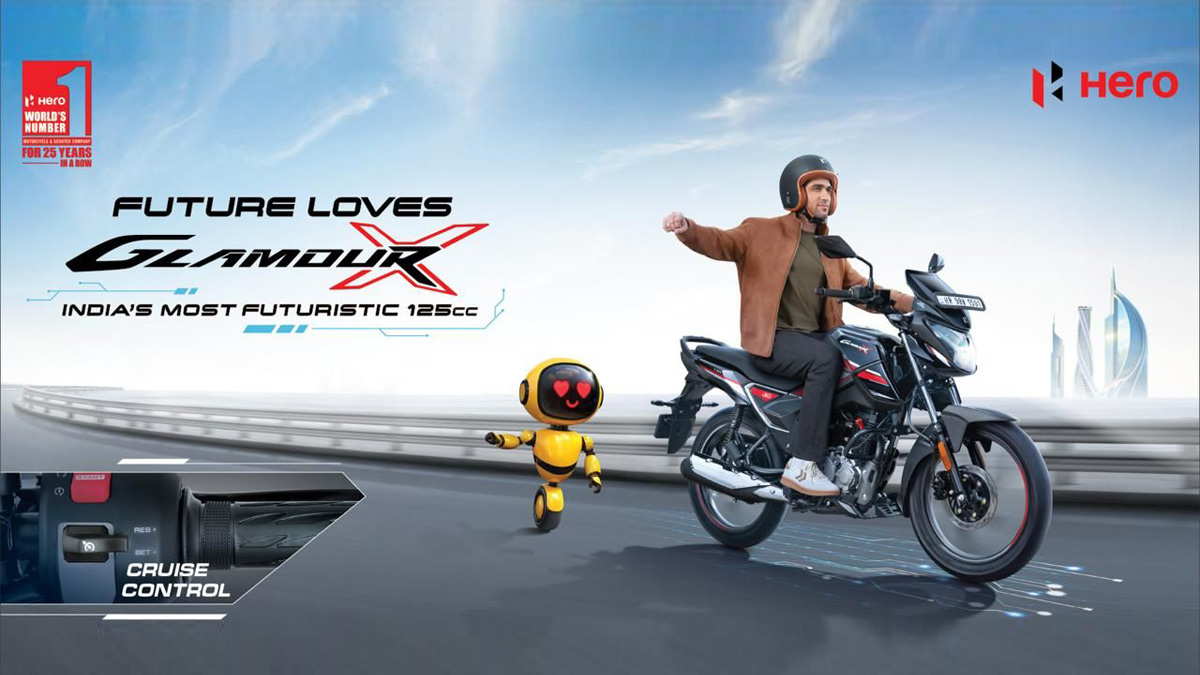
FCB Interface film reimagines the 125cc motorcycle through a futuristic romance
NATIONAL: Hero MotoCorp has unveiled a new brand film for Glamour X, using science fiction and nostalgia to reposition its flagship 125cc motorcycle for a younger, tech-savvy audience.
Created by FCB Interface, the campaign imagines a futuristic world in which a robot develops an unexpected emotional bond with Glamour X, set to the iconic track Pehla Nasha. The film leans on visual spectacle and sentiment to frame the motorcycle as an object of desire rather than mere utility.
The campaign marks a deliberate push to upgrade the perception of the 125cc segment, traditionally viewed as economical and functional. Hero MotoCorp is positioning Glamour X as India’s most futuristic motorcycle in the category, equipped with category-first features such as cruise control, while remaining accessible on price.
Hero MotoCorp head of marketing Aashish Midha, said the campaign reflects the brand’s ambition to redefine everyday mobility. He added that Glamour’s long-standing popularity made it the ideal platform to showcase how advanced technology and affordability can coexist.
The campaign is currently live across television and digital platforms and is being amplified during the Men’s T20 World Cup to maximise reach among mass and youth audiences.
Brands
Godrej clarifies ‘GI’ identifier after logo similarity debate
Says GI is not a logo, will not replace Godrej signature across products.
MUMBAI: In a branding storm where shapes did the talking, Godrej is now spelling things out. Godrej Industries Group (GIG) has issued a clarification on its newly introduced ‘GI’ identifier, addressing questions around its purpose and design following a wave of online criticism. At the centre of the debate were two concerns: whether the new mark replaces the long-standing Godrej logo, and whether its geometric design mirrors other corporate identities.
The company has drawn a clear line. The Godrej signature logo, it said, remains unchanged and continues to be the sole logo across all consumer-facing products and services. The ‘GI’ mark, by contrast, is not a logo but a corporate group identifier intended for use alongside the Godrej signature or company name, and aimed at stakeholders such as investors, media and talent rather than consumers.
The need for such a distinction stems from the 2024 restructuring of the broader Godrej Group into two separate business entities. With both continuing to operate under the same Godrej name and signature, the identifier is positioned as a way to differentiate the Godrej Industries Group at a corporate level.
The rollout, however, triggered a broader conversation on design originality. Critics pointed to similarities between the GI mark’s geometric composition and logos used by companies globally, raising questions about distinctiveness.
Responding to this, GIG said its intellectual property and legal review found that such overlaps are common in minimalist, geometry-led design systems. Basic forms such as circles and rectangles appear across dozens of brand identities worldwide, the company noted.
It added that the identifier emerged from an extensive design process and was chosen for its simplicity, allowing it to sit alongside the Godrej signature without competing visually. While acknowledging that elemental shapes may appear less distinctive in isolation, the group emphasised that the mark is part of a broader identity system that includes a custom typeface, sonic branding and other proprietary elements.
Following legal and ethical assessments, the company said it found no impediment to using the identifier, reiterating that the GI mark is a corporate tool not a consumer-facing symbol.
In short, the logo isn’t changing but the conversation around it certainly has.


