Brands
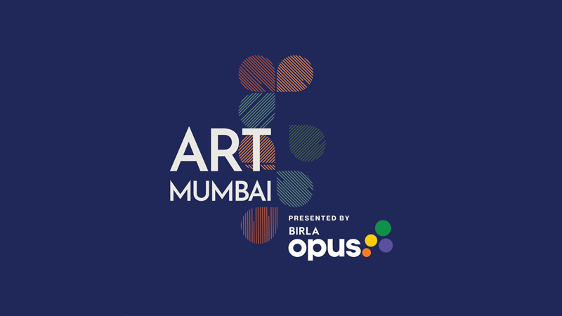
Birla Opus Paints partners With Art Mumbai
Mumbai: As a new age and innovative paint brand that understands and solves today’s modern consumer needs through its superior product performance, Birla Opus Paints is now joining hands with Art Mumbai 2024 to celebrate modern and contemporary art like never before.
Bringing to life the vibrant tapestry of Indian, South Asian and International art, Birla Opus Paints housed under Aditya Birla Group’s Grasim Industries, has come on board as the presenting partner for Art Mumbai’s second edition. Commencing today at the iconic Mahalaxmi Racecourse, the much-talked-about festival is set to build on the success of its inaugural year, showcasing a diverse collection of art from around the world.
Much like Birla Opus Paints, Art Mumbai 2024 sees art enthusiasts, designers, decorators, and connoisseurs embarking on a journey of artistic discovery, cultural exchange and celebrating the transformative power of art and color. What’s more is that the celebration is a fusion of art and color for creating a beautiful surrounding, something synonymous with Birla Opus Paints.

Birla Opus Paints is taking its commitment to fostering artistic expression and building a strong community a step ahead through this association with Art Mumbai.
Strengthening the partnership, the festival has an exclusive Birla Opus lounge for VIPs, designed to catch a quick break before jumping back into the brilliance of the artwork as well as a Birla Opus Auditorium where the much-appreciated Speaker Series will be presented giving patrons an opportunity to better understand art, culture and colors better. Integrated seamlessly into the fabric of the event, each wall is also painted with a unique color from the range of tints from Birla Opus Paints. This collaboration underscores Birla Opus Paints’ core values of creativity and innovation, solidifying its role by showcasing the rich artistic heritage of South Asia on a global platform.
Talking about the association, Birla Opus Paints head of marketing Inderpreet Singh says, “At Birla Opus Paints, we believe that color is more than just an aesthetic choice – it is a powerful medium that reflects and shapes cultural and personal expression. Art and color are powerful storytellers with each brushstroke narrating a part of India’s cultural tapestry. This collaboration with Art Mumbai blends our commitment to innovation with the transformative power of art.”
“We are delighted to have opened the second edition of a bigger and better Art Mumbai with a larger and more immersive showcase of modern and contemporary art from South Asia and around the world. We are honored to partner with Birla Opus Paints. This association with Birla Opus Paints has enhanced the experience of Art Mumbai, adding even more color to the fair, making this event a truly unique celebration of community and culture,” said Art Mumbai co-founder Dinesh Vazirani.


Brands
Godrej clarifies ‘GI’ identifier after logo similarity debate
Says GI is not a logo, will not replace Godrej signature across products.
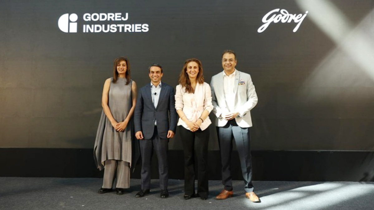
MUMBAI: In a branding storm where shapes did the talking, Godrej is now spelling things out. Godrej Industries Group (GIG) has issued a clarification on its newly introduced ‘GI’ identifier, addressing questions around its purpose and design following a wave of online criticism. At the centre of the debate were two concerns: whether the new mark replaces the long-standing Godrej logo, and whether its geometric design mirrors other corporate identities.
The company has drawn a clear line. The Godrej signature logo, it said, remains unchanged and continues to be the sole logo across all consumer-facing products and services. The ‘GI’ mark, by contrast, is not a logo but a corporate group identifier intended for use alongside the Godrej signature or company name, and aimed at stakeholders such as investors, media and talent rather than consumers.
The need for such a distinction stems from the 2024 restructuring of the broader Godrej Group into two separate business entities. With both continuing to operate under the same Godrej name and signature, the identifier is positioned as a way to differentiate the Godrej Industries Group at a corporate level.
The rollout, however, triggered a broader conversation on design originality. Critics pointed to similarities between the GI mark’s geometric composition and logos used by companies globally, raising questions about distinctiveness.
Responding to this, GIG said its intellectual property and legal review found that such overlaps are common in minimalist, geometry-led design systems. Basic forms such as circles and rectangles appear across dozens of brand identities worldwide, the company noted.
It added that the identifier emerged from an extensive design process and was chosen for its simplicity, allowing it to sit alongside the Godrej signature without competing visually. While acknowledging that elemental shapes may appear less distinctive in isolation, the group emphasised that the mark is part of a broader identity system that includes a custom typeface, sonic branding and other proprietary elements.
Following legal and ethical assessments, the company said it found no impediment to using the identifier, reiterating that the GI mark is a corporate tool not a consumer-facing symbol.
In short, the logo isn’t changing but the conversation around it certainly has.