News Broadcasting
MAK to launch soon; but will the viewer bite?
MAK TV, so far shrouded in secrecy and some spicy speculation, will fill the small screens very soon. The 31 December deadline that was being talked about, has come and gone, but the veils will be taken off anytime now, it is learnt.
In a crowded marketplace with umpteen channels in every possible genre elbowing each other for space, MAK TV better have some strong content ready in its six-channel offering. Apart from a music channel, Style – a fashion channel and Prime – a regular Hindi entertainment channel, there are three regional channels. While the Telugu and the Bangla channels are in for some stiff competition (the strongest coming from the ETV stable), a combined Sindhi-Gujarati channel may well hit it off with audiences due to its novel positioning.
The entire management team of MAK (Manoranjan, Aur Kya), headed by CEO Karan Saluja, has been comfortably housed in office space bought at the western suburb of Andheri in Mumbai. Reports indicate an initial investment of Rs 700 million has been made by unnamed promoters.

Several key personnel from rival channels have been inducted to beef up the team. There are four directors in Hitesh Sabharwal, former distribution head of Sony Entertainment Television, Satish Menon, former head of Zee News, Prashant Sanwal, former V-P, SET MAX and Amit Ray, executive VP Mudra Communications. Ray however, is not leaving Mudra but will function in an advisory capacity on the board.
Rupa Das, former programming V-P, Sony and Vaishali Sharma (ex-Sony again) in marketing are also on the team.


News Broadcasting
CNBC India unveils new logo, rolls out refreshed identity across network
Debuted at IBLA, the redesign signals a sharper, digital-first future
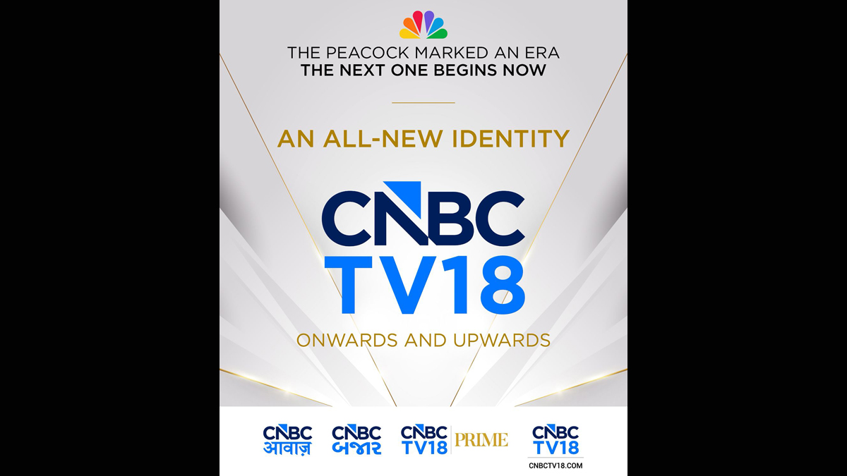
MUMBAI: CNBC has unveiled a refreshed brand identity across its India network, introducing a new logo and visual system that reflects a more modern, digital-first direction.
The rebrand was officially revealed at the India Business Leader Awards held in Mumbai on March 14, marking the first public showcase of the updated design at one of the network’s most prominent platforms.
The overhaul is among the most visible brand updates for CNBC in recent years, aimed at aligning its look and feel with evolving audience habits and a growing multi-platform presence.
At the centre of the refresh is a redesigned logo that moves away from the network’s long-standing multi-coloured peacock motif, opting instead for a cleaner and more minimalist aesthetic. A key visual cue is a blue upward-pointing arrow embedded within the letter ‘N’, symbolising forward momentum, growth and a focus on the future.
The new identity is being rolled out across the entire CNBC cluster in India, including CNBC-TV18, CNBC-TV18 Prime, CNBCTV18.com, CNBC Awaaz and CNBC Bajar. The move brings a more cohesive and contemporary design language across television and digital platforms alike.
The rollout began on March 30, with the network aiming to create a unified viewer experience regardless of how audiences access its content, be it on broadcast, online or connected devices.
With this refresh, CNBC is signalling its next phase of growth in India, blending legacy credibility with a sharper, forward-looking identity designed for an increasingly digital news ecosystem.