Brands
Use 21-day lockdown to quit smoking, says Nicotex
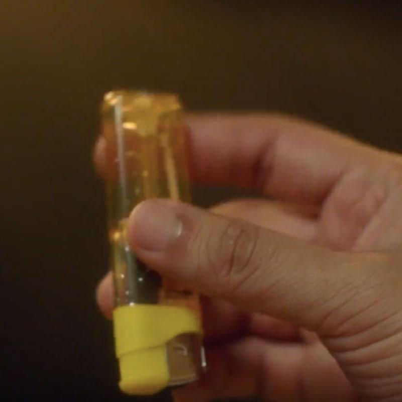
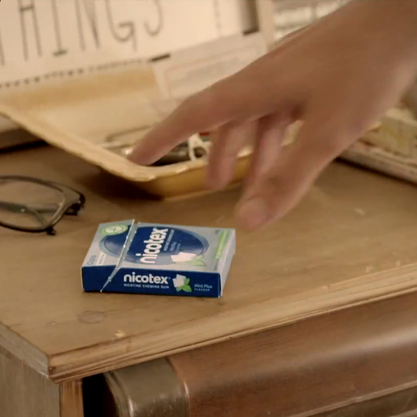
MUMBAI: Nicotex, the leading brand in the smoking cessation category by Cipla Health Ltd has introduced a ‘21 Days to Quit Smoking Challenge’ exhorting smokers to quit smoking. As the nation entered a 21-day lockdown due to COVID-19 and is practicing social distancing, Nicotex also urged individuals to distance themselves from cigarettes by highlighting the health hazards of smoking in such times.
According to the world health organisation (WHO), smoking damages the lungs, making the person more vulnerable to COVID- 19. Also while smoking, the fingers (and possibly contaminated cigarettes) come in contact with lips which increases the possibility of transmission of the virus from hand to mouth. Hence for safer and better health during the growing pandemic spread, it is advisable to quit smoking at the earliest.
Link of the video: https://www.youtube.com/watch?v=KmxWnTDOCZY&feature=youtu.be
It is also a well-established fact that it takes around 21 days for developing or breaking a habit, thereby inducing the thought that if a person does not smoke for 21 days, there are high chances that he or she will not be tempted to do the same later. The idea might appear like a herculean task; however, Nicotex, based on the principle of Nicotine Replacement Therapy can help smokers in their journey to quit smoking. It helps control the urge to smoke, and gradually allows the body to adjust having no nicotine at the end of the therapy.
Commenting on this campaign Cipla Health Ltd CEO Shivam Puri said, “As the entire country is taking efforts to practice social distancing and build immunity to combat potential threats of COVID-19, it is also the best time to distance oneself from the habit of smoking. During these times as much as a poor immune system can make individuals increasingly susceptible to the virus, smoking can damage the lungs and make a person more vulnerable. We are hence reaching out to all smokers to give up smoking and adopt a healthier lifestyle. We believe you can!”
Brands
Godrej clarifies ‘GI’ identifier after logo similarity debate
Says GI is not a logo, will not replace Godrej signature across products.
MUMBAI: In a branding storm where shapes did the talking, Godrej is now spelling things out. Godrej Industries Group (GIG) has issued a clarification on its newly introduced ‘GI’ identifier, addressing questions around its purpose and design following a wave of online criticism. At the centre of the debate were two concerns: whether the new mark replaces the long-standing Godrej logo, and whether its geometric design mirrors other corporate identities.
The company has drawn a clear line. The Godrej signature logo, it said, remains unchanged and continues to be the sole logo across all consumer-facing products and services. The ‘GI’ mark, by contrast, is not a logo but a corporate group identifier intended for use alongside the Godrej signature or company name, and aimed at stakeholders such as investors, media and talent rather than consumers.
The need for such a distinction stems from the 2024 restructuring of the broader Godrej Group into two separate business entities. With both continuing to operate under the same Godrej name and signature, the identifier is positioned as a way to differentiate the Godrej Industries Group at a corporate level.
The rollout, however, triggered a broader conversation on design originality. Critics pointed to similarities between the GI mark’s geometric composition and logos used by companies globally, raising questions about distinctiveness.
Responding to this, GIG said its intellectual property and legal review found that such overlaps are common in minimalist, geometry-led design systems. Basic forms such as circles and rectangles appear across dozens of brand identities worldwide, the company noted.
It added that the identifier emerged from an extensive design process and was chosen for its simplicity, allowing it to sit alongside the Godrej signature without competing visually. While acknowledging that elemental shapes may appear less distinctive in isolation, the group emphasised that the mark is part of a broader identity system that includes a custom typeface, sonic branding and other proprietary elements.
Following legal and ethical assessments, the company said it found no impediment to using the identifier, reiterating that the GI mark is a corporate tool not a consumer-facing symbol.
In short, the logo isn’t changing but the conversation around it certainly has.


