Brands
Tute Consult partners with health & glow to lead its communications mandate

Mumbai: Health & glow, a homegrown beauty and personal care destination has appointed Tute Consult, an integrated communications firm as its communication partner for driving a two-fold communications strategy for B2C and B2B stakeholders.
Tute Consult will be responsible to build the brand’s awareness and consideration amongst the consumers and strengthen its media presence through strategic communications and planning, said the statement.
The agency aims to create awareness of the brand’s online presence and highlight its revolutionised approach, which offers an innovative, convenient, and quality omnichannel shopping experience from across the country, it added.

“With the industry expecting an upswing and entry of new brands and product innovations, we are looking forward to redefining personalisation and further enhancing the overall experience for our customers,” stated health & glow managing director and CEO K Venkataramani. “We aim to take the retail experience to another level and make online shopping even more convenient through our innovative omnichannel offerings as we enter the 25th year with a forward-thinking approach.”
“We believe that the team at Tute Consult, through their vast experience in the sector, has the expertise to drive our vision through a strategic communication roadmap and support us in strengthening our relationship and position in the industry and amongst our stakeholders. We are excited and look forward to great innings,” he further said.
The personal care products company has been continually evolving in the beauty and personal care space and is all set to further expanding its in-house brand portfolio along with its own flagship products, said the brand.
“With the changing consumer behaviour, we believe we are at the cusp of the self-care revolution both in the health and beauty industry. Personal care industry is one of the booming industries today with an always-on innovation mode,” said Tute Consult founder Komal Lath. “Communication, therefore, has to be in an always-on innovation mode too. Our expertise in the beauty, FMCG and D2C sector over the years has refined our thought process and our approach to communication output all of which we have planned to utilise for the brand.”


Brands
Godrej clarifies ‘GI’ identifier after logo similarity debate
Says GI is not a logo, will not replace Godrej signature across products.
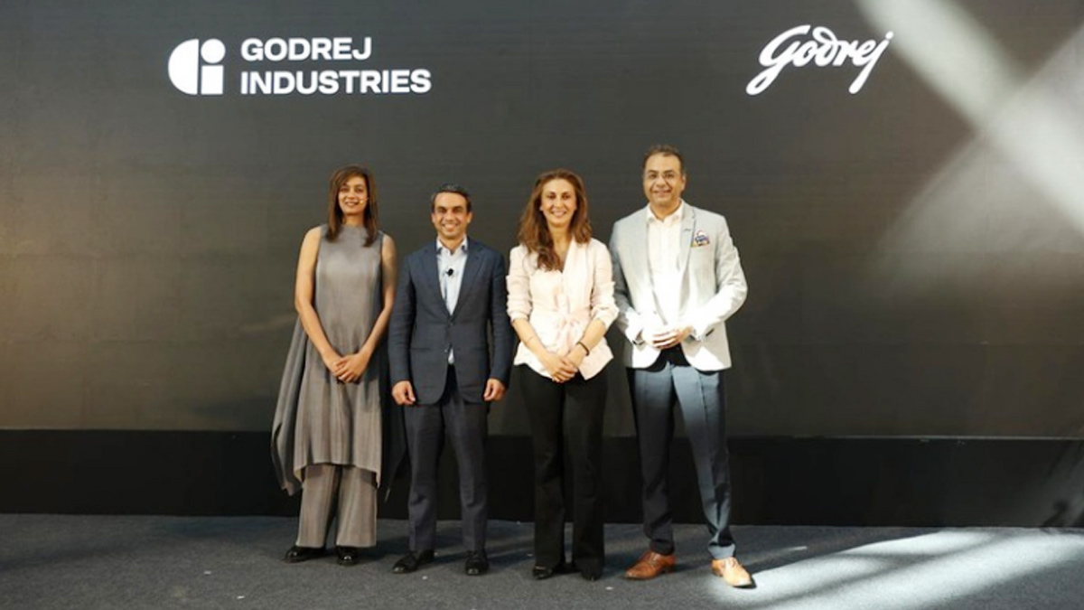
MUMBAI: In a branding storm where shapes did the talking, Godrej is now spelling things out. Godrej Industries Group (GIG) has issued a clarification on its newly introduced ‘GI’ identifier, addressing questions around its purpose and design following a wave of online criticism. At the centre of the debate were two concerns: whether the new mark replaces the long-standing Godrej logo, and whether its geometric design mirrors other corporate identities.
The company has drawn a clear line. The Godrej signature logo, it said, remains unchanged and continues to be the sole logo across all consumer-facing products and services. The ‘GI’ mark, by contrast, is not a logo but a corporate group identifier intended for use alongside the Godrej signature or company name, and aimed at stakeholders such as investors, media and talent rather than consumers.
The need for such a distinction stems from the 2024 restructuring of the broader Godrej Group into two separate business entities. With both continuing to operate under the same Godrej name and signature, the identifier is positioned as a way to differentiate the Godrej Industries Group at a corporate level.
The rollout, however, triggered a broader conversation on design originality. Critics pointed to similarities between the GI mark’s geometric composition and logos used by companies globally, raising questions about distinctiveness.
Responding to this, GIG said its intellectual property and legal review found that such overlaps are common in minimalist, geometry-led design systems. Basic forms such as circles and rectangles appear across dozens of brand identities worldwide, the company noted.
It added that the identifier emerged from an extensive design process and was chosen for its simplicity, allowing it to sit alongside the Godrej signature without competing visually. While acknowledging that elemental shapes may appear less distinctive in isolation, the group emphasised that the mark is part of a broader identity system that includes a custom typeface, sonic branding and other proprietary elements.
Following legal and ethical assessments, the company said it found no impediment to using the identifier, reiterating that the GI mark is a corporate tool not a consumer-facing symbol.
In short, the logo isn’t changing but the conversation around it certainly has.