Connect with us

Brands

Tirumal Mannur promoted to director at Samsung India Electronics

Longtime Samsung executive steps up to drive strategy and growth in India

Published

on

GURUGRAM: Samsung has turned to one of its longest-serving leaders in India for its next chapter of growth. Tirumal Mannur has been promoted to director at Samsung India Electronics, effective March 2026.

Based in Gurugram, Mannur will lead key strategic business units and help strengthen Samsung’s market leadership in the country. The role places him at the centre of the company’s efforts to sharpen its consumer electronics strategy and accelerate growth in one of its most important global markets.

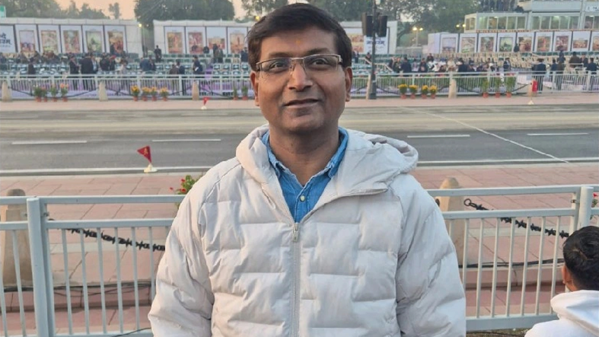
Announcing the move, Mannur shared the news on LinkedIn, saying he was “happy to share” that he has started a new position as director at Samsung India Electronics Limited in Gurugram.

Advertisement

The promotion marks another milestone in Mannur’s long association with Samsung. He joined the company in 2009 and spent more than 16 years rising through the ranks, most recently serving as general manager.

Over the years, he has built deep expertise in consumer electronics, national sales and channel development, helping Samsung expand its footprint across India’s fast evolving electronics market.

Before joining Samsung, Mannur worked as national sales manager at TCL Electronics India. Earlier in his career, he held roles at LG Electronics, Whirlpool Co India Limited and Matsushita Air Conditioning India.

Advertisement

With more than two decades of experience across some of the biggest names in consumer electronics, Mannur now steps into the director’s role at a time when competition in India’s technology market is intensifying and demand for smart devices continues to surge.

Click to comment

Leave a Reply

Your email address will not be published. Required fields are marked *

Brands

Godrej clarifies ‘GI’ identifier after logo similarity debate

Says GI is not a logo, will not replace Godrej signature across products.

Published

on

MUMBAI: In a branding storm where shapes did the talking, Godrej is now spelling things out. Godrej Industries Group (GIG) has issued a clarification on its newly introduced ‘GI’ identifier, addressing questions around its purpose and design following a wave of online criticism. At the centre of the debate were two concerns: whether the new mark replaces the long-standing Godrej logo, and whether its geometric design mirrors other corporate identities.

The company has drawn a clear line. The Godrej signature logo, it said, remains unchanged and continues to be the sole logo across all consumer-facing products and services. The ‘GI’ mark, by contrast, is not a logo but a corporate group identifier intended for use alongside the Godrej signature or company name, and aimed at stakeholders such as investors, media and talent rather than consumers.

The need for such a distinction stems from the 2024 restructuring of the broader Godrej Group into two separate business entities. With both continuing to operate under the same Godrej name and signature, the identifier is positioned as a way to differentiate the Godrej Industries Group at a corporate level.

Advertisement

The rollout, however, triggered a broader conversation on design originality. Critics pointed to similarities between the GI mark’s geometric composition and logos used by companies globally, raising questions about distinctiveness.

Responding to this, GIG said its intellectual property and legal review found that such overlaps are common in minimalist, geometry-led design systems. Basic forms such as circles and rectangles appear across dozens of brand identities worldwide, the company noted.

It added that the identifier emerged from an extensive design process and was chosen for its simplicity, allowing it to sit alongside the Godrej signature without competing visually. While acknowledging that elemental shapes may appear less distinctive in isolation, the group emphasised that the mark is part of a broader identity system that includes a custom typeface, sonic branding and other proprietary elements.

Advertisement

Following legal and ethical assessments, the company said it found no impediment to using the identifier, reiterating that the GI mark is a corporate tool not a consumer-facing symbol.

In short, the logo isn’t changing but the conversation around it certainly has.

Advertisement
Continue Reading

Advertisement News18
Advertisement
Advertisement
Advertisement
Advertisement Whtasapp
Advertisement Year Enders

Indian Television Dot Com Pvt Ltd

Signup for news and special offers!

Copyright © 2026 Indian Television Dot Com PVT LTD

This will close in 10 seconds