Connect with us

Brands

Shaadi.com stirs up Lucknow with giant kadhai ad

Published

on

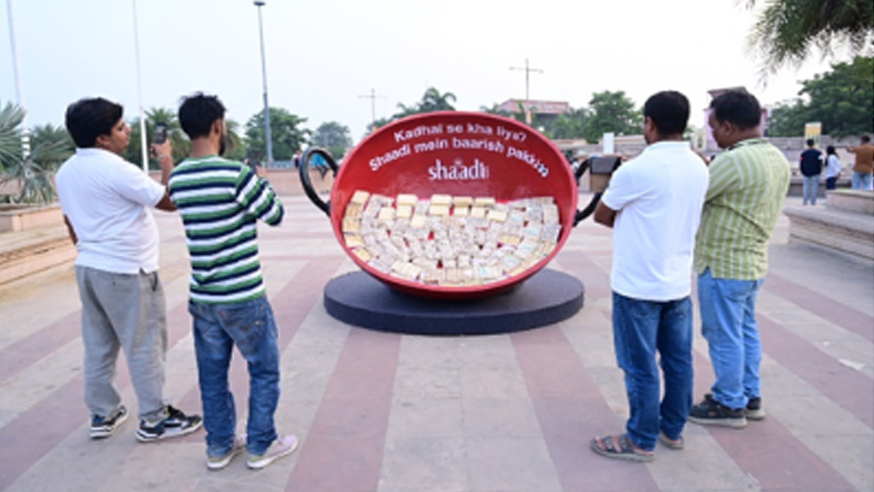
MUMBAI: Who knew a humble kitchen kadhai could cook up such a storm? Shaadi.com’s latest outdoor campaign in Lucknow has done just that, turning a beloved North Indian superstition into a citywide spectacle.

Partnering with Moms, the outdoor specialist from Madison World, the matchmaking platform unveiled a giant kadhai installation that instantly caught eyes and sparked conversations both on the streets and online. The campaign draws from the cheeky local saying, “Kadhai se kha liye? Shaadi mein baarish pakki!,” a superstition as familiar as it is funny.

By turning that everyday phrase into a playful visual, the campaign struck a chord with audiences who couldn’t resist stopping for selfies, laughs, and a touch of nostalgia. It was a perfect recipe for virality, a mix of wit, warmth and cultural flair.

Advertisement

“With this campaign, we wanted to showcase Shaadi.com’s relatable, light-hearted side in a way that truly connects with regional culture,” said Moms chief executive officer Jayesh Yagnik. “The kadhai idea taps into a shared superstition and turns it into a moment of joy and connection.”

Shaadi.com brand manager – creative and social Johanna Israni added, “Some of the best ideas come from simple memories. Sneaking a bite from the kadhai is a universal moment, and we just blew it up, literally, to bring a smile to everyone’s face.”

Conceptualised by Shaadi.com’s in-house creative team and executed with Moms, the campaign was further amplified digitally by Pulpkey. The result? A light-hearted outdoor activation that served equal parts nostalgia and novelty, proving that in advertising, sometimes all it takes is a good story, a great laugh, and one oversized kadhai.

Advertisement


Click to comment

Leave a Reply

Your email address will not be published. Required fields are marked *

Brands

Godrej clarifies ‘GI’ identifier after logo similarity debate

Says GI is not a logo, will not replace Godrej signature across products.

Published

on

MUMBAI: In a branding storm where shapes did the talking, Godrej is now spelling things out. Godrej Industries Group (GIG) has issued a clarification on its newly introduced ‘GI’ identifier, addressing questions around its purpose and design following a wave of online criticism. At the centre of the debate were two concerns: whether the new mark replaces the long-standing Godrej logo, and whether its geometric design mirrors other corporate identities.

The company has drawn a clear line. The Godrej signature logo, it said, remains unchanged and continues to be the sole logo across all consumer-facing products and services. The ‘GI’ mark, by contrast, is not a logo but a corporate group identifier intended for use alongside the Godrej signature or company name, and aimed at stakeholders such as investors, media and talent rather than consumers.

The need for such a distinction stems from the 2024 restructuring of the broader Godrej Group into two separate business entities. With both continuing to operate under the same Godrej name and signature, the identifier is positioned as a way to differentiate the Godrej Industries Group at a corporate level.

Advertisement

The rollout, however, triggered a broader conversation on design originality. Critics pointed to similarities between the GI mark’s geometric composition and logos used by companies globally, raising questions about distinctiveness.

Responding to this, GIG said its intellectual property and legal review found that such overlaps are common in minimalist, geometry-led design systems. Basic forms such as circles and rectangles appear across dozens of brand identities worldwide, the company noted.

It added that the identifier emerged from an extensive design process and was chosen for its simplicity, allowing it to sit alongside the Godrej signature without competing visually. While acknowledging that elemental shapes may appear less distinctive in isolation, the group emphasised that the mark is part of a broader identity system that includes a custom typeface, sonic branding and other proprietary elements.

Advertisement

Following legal and ethical assessments, the company said it found no impediment to using the identifier, reiterating that the GI mark is a corporate tool not a consumer-facing symbol.

In short, the logo isn’t changing but the conversation around it certainly has.

Advertisement
Continue Reading

Advertisement News18
Advertisement
Advertisement
Advertisement
Advertisement Whtasapp
Advertisement Year Enders

Indian Television Dot Com Pvt Ltd

Signup for news and special offers!

Copyright © 2026 Indian Television Dot Com PVT LTD

This will close in 10 seconds