Brands
Mahesh stays on board with AbhiBus for another blockbuster journey

MUMBAI: When it comes to bus bookings, Mahesh Babu isn’t just riding shotgun, he’s driving trust. Abhibus, Ixigo’s bus ticketing arm, has renewed its nearly decade-long partnership with Tollywood icon Mahesh Babu, extending one of the longest-standing celebrity-brand collaborations in India’s mobility space. First onboarded in 2016, the superstar continues as the face of AbhiBus in 2025, a partnership built on reliability, relatability, and regional resonance.
From quirky in-transit ads to heart-tugging tales of homecoming, the duo has delivered some memorable campaigns over the years. This summer, fans can look forward to a new campaign that rides on this legacy while showcasing Abhibus’s evolved customer offerings like the “Filter New Buses” feature and the “AbhiAssured” promise.
“Mahesh Babu has been more than just a brand ambassador, he’s been a fellow traveller in our journey of growth,” said Abhibus COO, Rohit Sharma. “From 2016 to 2025, his presence has helped us build deeper connections across the South and beyond.”

Mahesh Babu echoed this sentiment, saying, “My journey with Abhibus has always felt personal. It’s about making travel smoother and safer. Abhibus doesn’t just take you places, it makes sure you get there comfortably.”
As Abhibus expands across new markets, Mahesh Babu remains its most familiar co-passenger, a constant in a changing travel landscape, reminding Indian commuters that the ride can be just as memorable as the destination.


Brands
Godrej clarifies ‘GI’ identifier after logo similarity debate
Says GI is not a logo, will not replace Godrej signature across products.
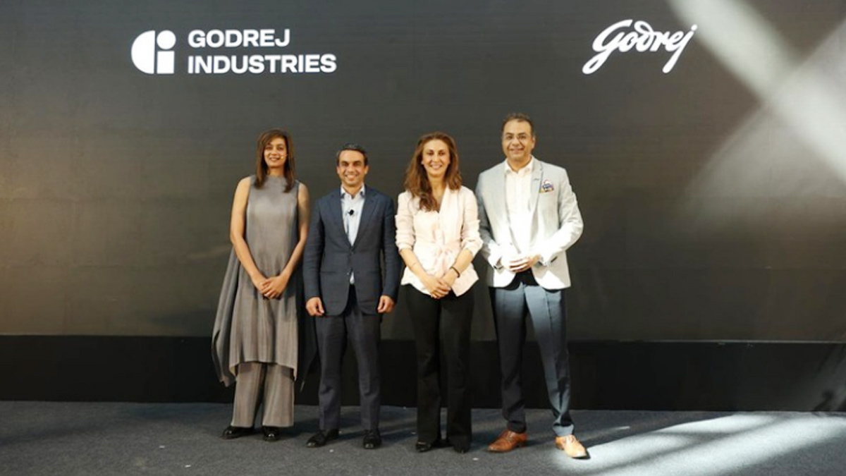
MUMBAI: In a branding storm where shapes did the talking, Godrej is now spelling things out. Godrej Industries Group (GIG) has issued a clarification on its newly introduced ‘GI’ identifier, addressing questions around its purpose and design following a wave of online criticism. At the centre of the debate were two concerns: whether the new mark replaces the long-standing Godrej logo, and whether its geometric design mirrors other corporate identities.
The company has drawn a clear line. The Godrej signature logo, it said, remains unchanged and continues to be the sole logo across all consumer-facing products and services. The ‘GI’ mark, by contrast, is not a logo but a corporate group identifier intended for use alongside the Godrej signature or company name, and aimed at stakeholders such as investors, media and talent rather than consumers.
The need for such a distinction stems from the 2024 restructuring of the broader Godrej Group into two separate business entities. With both continuing to operate under the same Godrej name and signature, the identifier is positioned as a way to differentiate the Godrej Industries Group at a corporate level.
The rollout, however, triggered a broader conversation on design originality. Critics pointed to similarities between the GI mark’s geometric composition and logos used by companies globally, raising questions about distinctiveness.
Responding to this, GIG said its intellectual property and legal review found that such overlaps are common in minimalist, geometry-led design systems. Basic forms such as circles and rectangles appear across dozens of brand identities worldwide, the company noted.
It added that the identifier emerged from an extensive design process and was chosen for its simplicity, allowing it to sit alongside the Godrej signature without competing visually. While acknowledging that elemental shapes may appear less distinctive in isolation, the group emphasised that the mark is part of a broader identity system that includes a custom typeface, sonic branding and other proprietary elements.
Following legal and ethical assessments, the company said it found no impediment to using the identifier, reiterating that the GI mark is a corporate tool not a consumer-facing symbol.
In short, the logo isn’t changing but the conversation around it certainly has.