AD Agencies
Guest column: Ads that didn’t work!
The advertising sector is expected to be a sophisticated and creative one. Creative heads spend hours ensuring the advertising is ‘done right’. Yet, year after year, we come across ads that fail to make any mark and instead end up being called as dunce.
These ads lack engaging storytelling, creativity and in most cases are poorly executed with actors overdoing the act.
The small and local brands deliver such howlers as they only have a small amount to spare on advertising and limited creative counsel. But at times we come across deep-pocketed household name that create bad advertisements.

If it all becomes too much to bear, please cheer yourself up with our listicle on best animated ads in India and ads that rapped with consumers.
Inspiration exists at both ends of the creative scale.The higher end has fewer options to engage with. So, here are five gems according to Publicis India head of creative Nitin Pradhan who was talking to Indiantelevision.com’s Santosh Jangid.
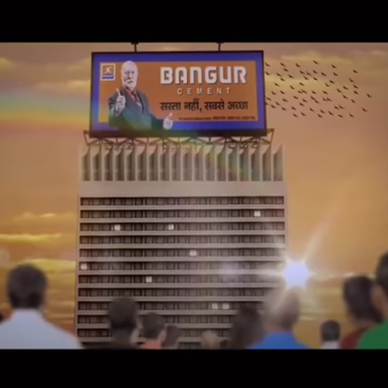
Bangur Cement – Godzilla.
You’ve got to give it to this one for the sheer confidence and nerve with which it attacked the air waves.
The plot is to die for and the CG scary. Godzilla rises from the shallows of the Arabian Sea and brings down our very own Bandra Worli sea link only to bang its head and lose its tail (you read that right) to a skyscraper. A white-bearded foreigner and a few flying birds usher in a rainbow.
I’m sure they thought of it on the way to the shoot.
JK Super Cement
It has graced Indian Advertising’s Hall of Fame for long now. A skimpily clad girl rises from the sea and threateningly walks towards us before breaking into a smile. A deep voice in the background interprets the metaphor, “Vishwaas hai. Isme kuchh khaas hai.” Subtle!
Pan Bahar
Pierce Brosnan walks into a casting coup and trips. An idea which will be remembered for eons, for reasons unintended.
When in doubt cast a white man. When in more doubt cast a famous white man. And it will work. It did. And so did many Bhojpuri films.
Micromax – Nuts, Guts, Glory.
The white man fascination continues and gets scaled up. There are many white men. And women. Quite sure the idea was to appeal to the ‘youth’.
The brand attempts to climb several rungs of the ‘aspirational’ ladder. Taking potshots at an icnoic fruit-logo brand definitely needs guts.
Not sure why they had to replace this piece so soon, then. Maybe, the boring small towners preferred reality.
MDH Spices – Flight of Taste
It’s a flight full of Indians. With a pinch of white skin added to taste. Words like ‘Khushbu’, ‘Swaad’, ‘Taste’ and the three magical letters are thrown in generously in a modest attempt to self-garland the brand multiple times along with its veteran creator. Life saving spices are dropped on to flavour starved regions of the world along with parachutes. Imagination takes a jump without one.

The observations made in this piece by Nitin Pradhan, in the pix, are with no malice at heart or high-handedness in the head against any individual or organisation. There’s always a good reason behind every piece of not-so-good work. And, how can one judge good from bad when one has been a partner in crime, some time or the other. Good sense prevails only when we look back and analyse. May be, this is that moment, according to Pradhan. However, Indiantelevision.com may not subscribe to his personal views expressed here. |


AD Agencies
Liqvd Asia wins four mandates, adds Rs 35 crore pipeline
New clients across sectors signal strong start to 2026 for agency
MUMBAI: Liqvd Asia has kicked off 2026 on a high note, securing four new mandates that are set to add roughly Rs 35 crore to its future business pipeline.
The digital-first agency has brought on board a diverse mix of clients, including Origami, Kasturi Foods, Sama.live and Woodland, spanning consumer goods, regional brands, emerging platforms and established players.
Each mandate comes with a tailored brief. While the agency will handle integrated marketing communications for Origami, it will manage creative, social and media duties for Kasturi Foods as the brand looks to expand beyond its Odisha stronghold. For Sama.live, the focus will be on building brand narrative and enterprise credibility, while Woodland’s mandate centres on digital and social storytelling.
For Liqvd Asia founder and managing director Arnab Mitra, the wins reflect a deliberate shift in how the agency positions itself. He said the focus is on being an integrated growth partner, combining strategy and creativity to deliver long-term brand value alongside business impact.
Echoing this, Liqvd Asia business head Monish Sanghavi, highlighted that the new partnerships align with the agency’s intent to build scalable and structured growth roadmaps, where creativity is anchored in data and performance is closely tied to outcomes.
From the client side, Kasturi Foods sees the collaboration as a step towards national expansion. The company said the partnership will help it balance its regional legacy with a sharper digital presence as it reaches new markets.
With a growing roster and a pipeline that is steadily thickening, Liqvd Asia appears to be turning early momentum into a broader statement. In a crowded digital marketplace, the agency is not just adding clients, it is adding intent.