Connect with us

Brands

Deme by Gabriella’s “Tropic of D” collection enchants at Lakmé Fashion Week

Published

on

Mumbai: The Lakmé Fashion Week, concluded with a surge of summery vibes as Deme by Gabriella Demetriades unveiled its captivating “Tropic of D” collection on the final day of Fashion Week (17 March). This wasn’t just a runway show; it was a coronation, anointing “Tropic of D” as the undisputed queen of summer fashion.

The front row, including Bollywood royalty and fashion elite, became a captivated court. Sonal Chauhan, Anusha Dandekar, Shibani Akhtar, Arjun Rampal along with son and daughter Mahika, Farah Ali Khan, and Pragya Kapoor – their mere presence added a mesmerising power to a dazzling evening. Yet, even amidst this star wattage, the true story unfolded on the runway.

Deme’s founder, Gabriella Demetriades, describes the collection as an ode to the carefree spirit of the season. “Flowing silhouettes that dance with every step, a vibrant tapestry of colours that kiss the skin, and a touch of playful charm that exudes confidence,” she said.

Advertisement

“This is the essence of ‘Tropic of D’ – a collection designed to make every woman the radiant star of her summer soiree.”


A post shared by Voompla (@voompla)

Advertisement


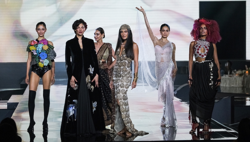
The fashion runway transformed into a tropical paradise as a breathtaking procession of gowns, each a masterpiece in its own right, glided down the platform. The collection pulsated with the carefree spirit of summer, a kaleidoscope of colours that seemed to explode off the fabric. Fiery oxblood reds mirrored the setting sun, ethereal sky blue whispered lazy summer afternoons, and chic beiges and olive hues echoed lush foliage.

These vibrant hues adorned the forms of Mahieka Sharma (New Age Model of the Year), the phenomenal Super Model Rikee Chatterjee, Pratiksha Shetty, Ikisvon Jamang (a rising star whose powerful presence matched the collection’s grandeur), Sakshi Sindhwani (a champion of inclusivity showcasing the collection’s versatility), and Subhiksha Shivkumar, each model a force in their own right. Some dazzling designs that caught the eye were the Oxblood silhouette, sculpted without sleeves, caressing the curves with delicate gathers, and a playful peek-a-boo cutout adding a touch of alluring mystery, perfect for balmy nights. The black mesh gown is adorned with 3D flowers that whisper of enchanted gardens. A stunning blue mermaid silhouette accented by a unique cowl finish and delicate organza flowers. Whimsy took centre stage with a chic beige halter neck dress adorned with crocheted seashells and starfish, while sophistication reigned supreme in a sleek black malai dress with a criss-cross ruched neckline.

Advertisement

Deme’s “Tropic of D” collection left an indelible mark on Lakmé Fashion Week. Each piece, imbued with the magic of a sun-drenched paradise, promises to be a coveted crown jewel in any wardrobe. It’s a collection designed for the woman who celebrates her individuality with an air of island opulence, a woman who doesn’t just command attention, she reigns supreme.

Click to comment

Leave a Reply

Your email address will not be published. Required fields are marked *

Brands

Godrej clarifies ‘GI’ identifier after logo similarity debate

Says GI is not a logo, will not replace Godrej signature across products.

Published

on

MUMBAI: In a branding storm where shapes did the talking, Godrej is now spelling things out. Godrej Industries Group (GIG) has issued a clarification on its newly introduced ‘GI’ identifier, addressing questions around its purpose and design following a wave of online criticism. At the centre of the debate were two concerns: whether the new mark replaces the long-standing Godrej logo, and whether its geometric design mirrors other corporate identities.

The company has drawn a clear line. The Godrej signature logo, it said, remains unchanged and continues to be the sole logo across all consumer-facing products and services. The ‘GI’ mark, by contrast, is not a logo but a corporate group identifier intended for use alongside the Godrej signature or company name, and aimed at stakeholders such as investors, media and talent rather than consumers.

The need for such a distinction stems from the 2024 restructuring of the broader Godrej Group into two separate business entities. With both continuing to operate under the same Godrej name and signature, the identifier is positioned as a way to differentiate the Godrej Industries Group at a corporate level.

Advertisement

The rollout, however, triggered a broader conversation on design originality. Critics pointed to similarities between the GI mark’s geometric composition and logos used by companies globally, raising questions about distinctiveness.

Responding to this, GIG said its intellectual property and legal review found that such overlaps are common in minimalist, geometry-led design systems. Basic forms such as circles and rectangles appear across dozens of brand identities worldwide, the company noted.

It added that the identifier emerged from an extensive design process and was chosen for its simplicity, allowing it to sit alongside the Godrej signature without competing visually. While acknowledging that elemental shapes may appear less distinctive in isolation, the group emphasised that the mark is part of a broader identity system that includes a custom typeface, sonic branding and other proprietary elements.

Advertisement

Following legal and ethical assessments, the company said it found no impediment to using the identifier, reiterating that the GI mark is a corporate tool not a consumer-facing symbol.

In short, the logo isn’t changing but the conversation around it certainly has.

Advertisement
Continue Reading

Advertisement News18
Advertisement
Advertisement
Advertisement
Advertisement Whtasapp
Advertisement Year Enders

Indian Television Dot Com Pvt Ltd

Signup for news and special offers!

Copyright © 2026 Indian Television Dot Com PVT LTD

This will close in 10 seconds