Brands
Colgate’s Bright Idea hits 2 billion smiles globally, 185 million in India
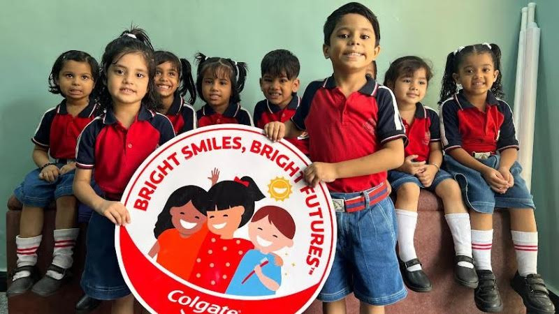
MUMBAI: A smile really does go a long way in Colgate’s case, 2 billion smiles. The oral care giant has announced that its flagship initiative and CSR arm, Bright Smiles, Bright Futures® (BSBF), has now reached over 2 billion children worldwide. In India alone, more than 185 million children and families have already been touched by the programme’s message of preventive oral health.
Launched in 1991, BSBF has become one of the world’s largest oral health education drives, offering not just toothbrushes and toothpaste but also something far more powerful: awareness. By partnering with governments, NGOs, schools and dentists, Colgate has helped make brushing and oral hygiene a priority in communities that often lack access to even the basics of dental care.
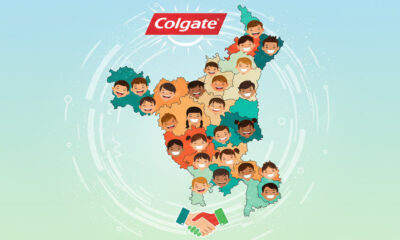
In India, where tooth decay and gum disease remain stubbornly common, the programme is working closely with state education and health departments in Uttar Pradesh, Maharashtra, Assam, Bihar, Andhra Pradesh, Kerala and Goa. Each year, the aim is to reach over 10 million more children and their families, spreading the habit of brushing and the confidence that comes with a healthy smile.
“As India shifts from reactive to preventive healthcare, public-private-policy partnerships are critical,” said Colgate-Palmolive director – esg & communications Shilpashree Muniswamappa. “Our programme is a shining example of how collaboration can inspire lasting behaviour change.”
From bustling metros to the remotest villages, Colgate’s vision is clear: every child deserves the chance to flash a healthy smile that lasts a lifetime. And with 2 billion already reached, it’s proof that even the smallest habit, brushing your teeth twice a day can create truly world-changing results.
Brands
Godrej clarifies ‘GI’ identifier after logo similarity debate
Says GI is not a logo, will not replace Godrej signature across products.
MUMBAI: In a branding storm where shapes did the talking, Godrej is now spelling things out. Godrej Industries Group (GIG) has issued a clarification on its newly introduced ‘GI’ identifier, addressing questions around its purpose and design following a wave of online criticism. At the centre of the debate were two concerns: whether the new mark replaces the long-standing Godrej logo, and whether its geometric design mirrors other corporate identities.
The company has drawn a clear line. The Godrej signature logo, it said, remains unchanged and continues to be the sole logo across all consumer-facing products and services. The ‘GI’ mark, by contrast, is not a logo but a corporate group identifier intended for use alongside the Godrej signature or company name, and aimed at stakeholders such as investors, media and talent rather than consumers.
The need for such a distinction stems from the 2024 restructuring of the broader Godrej Group into two separate business entities. With both continuing to operate under the same Godrej name and signature, the identifier is positioned as a way to differentiate the Godrej Industries Group at a corporate level.
The rollout, however, triggered a broader conversation on design originality. Critics pointed to similarities between the GI mark’s geometric composition and logos used by companies globally, raising questions about distinctiveness.
Responding to this, GIG said its intellectual property and legal review found that such overlaps are common in minimalist, geometry-led design systems. Basic forms such as circles and rectangles appear across dozens of brand identities worldwide, the company noted.
It added that the identifier emerged from an extensive design process and was chosen for its simplicity, allowing it to sit alongside the Godrej signature without competing visually. While acknowledging that elemental shapes may appear less distinctive in isolation, the group emphasised that the mark is part of a broader identity system that includes a custom typeface, sonic branding and other proprietary elements.
Following legal and ethical assessments, the company said it found no impediment to using the identifier, reiterating that the GI mark is a corporate tool not a consumer-facing symbol.
In short, the logo isn’t changing but the conversation around it certainly has.


