Brands
Skechers does it right with 3D display billboards
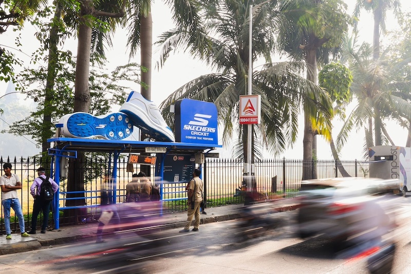
MUMBAI: Skechers India is hitting it out of the park. Last week, it decided to promote its cricket shoe range which it launched earlier this year. Right at the location where rising players congregate.
They chose the Oval cricket ground in south Mumbai where many a match – both professional and amateur – is held. The ground is known for its ferocious uneven bounce where a pacer’s ball can kick up suddenly and unexpectedly or a leg spinner’s innocuous ball can generate vicious turn.
The Skechers marketing team decided to shift shape the bus shelters into shoe: the Skechers cricket blade shoes. The speciality of these shoes is that they have seven metal spikes as compared to the Skechers cricket elite which have 11 metal spikes. The cricket collection is endorsed by cricketers Ishan Kishan and Yastika Bhatia.
Skechers 3D displays
“We have designed a product range that brings incomparable performance, grip, and comfort to the cricket oval,” had said Skechers Asia CEO Rahul Vira at the time of the launch.
Vira was full of praise for his marketing team’s promotional gig at the Oval ground.
Said he: “Thrilled to share our marketing team’s innovation of turning mundane bus shelters into interesting 3D billboards. Launching Skechers cricket blade shoes at the cricket lovers paradise in Mumbai The Oval Grounds – a symbol of Mumbai’s cricketing legacy.”
One will have to wait and watch whether the shoes leave their foot marks on cricketer’s dress wear.
(pictures courtesy: Rahul Vira’s linkedin account)
Brands
Godrej clarifies ‘GI’ identifier after logo similarity debate
Says GI is not a logo, will not replace Godrej signature across products.
MUMBAI: In a branding storm where shapes did the talking, Godrej is now spelling things out. Godrej Industries Group (GIG) has issued a clarification on its newly introduced ‘GI’ identifier, addressing questions around its purpose and design following a wave of online criticism. At the centre of the debate were two concerns: whether the new mark replaces the long-standing Godrej logo, and whether its geometric design mirrors other corporate identities.
The company has drawn a clear line. The Godrej signature logo, it said, remains unchanged and continues to be the sole logo across all consumer-facing products and services. The ‘GI’ mark, by contrast, is not a logo but a corporate group identifier intended for use alongside the Godrej signature or company name, and aimed at stakeholders such as investors, media and talent rather than consumers.
The need for such a distinction stems from the 2024 restructuring of the broader Godrej Group into two separate business entities. With both continuing to operate under the same Godrej name and signature, the identifier is positioned as a way to differentiate the Godrej Industries Group at a corporate level.
The rollout, however, triggered a broader conversation on design originality. Critics pointed to similarities between the GI mark’s geometric composition and logos used by companies globally, raising questions about distinctiveness.
Responding to this, GIG said its intellectual property and legal review found that such overlaps are common in minimalist, geometry-led design systems. Basic forms such as circles and rectangles appear across dozens of brand identities worldwide, the company noted.
It added that the identifier emerged from an extensive design process and was chosen for its simplicity, allowing it to sit alongside the Godrej signature without competing visually. While acknowledging that elemental shapes may appear less distinctive in isolation, the group emphasised that the mark is part of a broader identity system that includes a custom typeface, sonic branding and other proprietary elements.
Following legal and ethical assessments, the company said it found no impediment to using the identifier, reiterating that the GI mark is a corporate tool not a consumer-facing symbol.
In short, the logo isn’t changing but the conversation around it certainly has.


