Brands
Lizol introduces its first disinfectant concentrate for Indian consumers
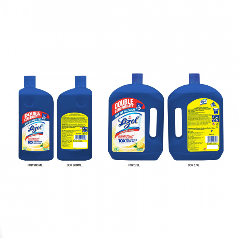
New Delhi: Lizol, one of RB’s leading disinfectant brands, announced the launch of its ‘e-commerce first’ innovation, Lizol Double Concentrate Disinfectant Surface Cleaner today. The product is Lizol’s first-ever disinfectant concentrate to be sold exclusively across e-commerce platforms in India keeping in mind the significant growth retail e-commerce has seen in the country.
Being at the forefront in its collaborative fight against Covid-19, Lizol is looking to expand its portfolio by providing consumers with a range of products that help break the chain of infection. The new Lizol Double Concentrate has a superior formulation which will give consumers 10X superior cleaning and kill 99.9% germs by using just half a cap.
Commenting on the launch RB Hygiene, South Asia CMO & marketing director Sukhleen Aneja said, “The Covid-19 pandemic has heightened the need and importance of maintaining safe hygiene practices as the first step towards preventive health care. Lizol’s new innovation is a 2X concentrated formula that is not only potent as a disinfectant but, is also a more sustainable option that is aimed at providing superior benefit value for consumers. It’s an ‘e-commerce first’ launch keeping in line with the changing shopper behavior.”
With this product innovation, RB showcases its commitment towards consumer centricity by ensuring greater degree of consumer convenience. It allows ease of use and fewer buying occasions while also actively pushing the envelope on making its products environment friendly.
“Lizol double concentrate is a powerful innovation that is effective and sustainable. The concentrate has gone through multiple tests to ensure germ-kill and superior cleaning while disinfecting surfaces. This is a convenient purchase option as compared to dilutables giving consumers more than 100 uses from just one bottle”, says RB Hygiene Head- Innovation Hub at India R&D Navin Sharma.
The product will be initially available in Citrus variant and in two different sizes – 900ml and 1.9 litre.
Brands
Godrej clarifies ‘GI’ identifier after logo similarity debate
Says GI is not a logo, will not replace Godrej signature across products.
MUMBAI: In a branding storm where shapes did the talking, Godrej is now spelling things out. Godrej Industries Group (GIG) has issued a clarification on its newly introduced ‘GI’ identifier, addressing questions around its purpose and design following a wave of online criticism. At the centre of the debate were two concerns: whether the new mark replaces the long-standing Godrej logo, and whether its geometric design mirrors other corporate identities.
The company has drawn a clear line. The Godrej signature logo, it said, remains unchanged and continues to be the sole logo across all consumer-facing products and services. The ‘GI’ mark, by contrast, is not a logo but a corporate group identifier intended for use alongside the Godrej signature or company name, and aimed at stakeholders such as investors, media and talent rather than consumers.
The need for such a distinction stems from the 2024 restructuring of the broader Godrej Group into two separate business entities. With both continuing to operate under the same Godrej name and signature, the identifier is positioned as a way to differentiate the Godrej Industries Group at a corporate level.
The rollout, however, triggered a broader conversation on design originality. Critics pointed to similarities between the GI mark’s geometric composition and logos used by companies globally, raising questions about distinctiveness.
Responding to this, GIG said its intellectual property and legal review found that such overlaps are common in minimalist, geometry-led design systems. Basic forms such as circles and rectangles appear across dozens of brand identities worldwide, the company noted.
It added that the identifier emerged from an extensive design process and was chosen for its simplicity, allowing it to sit alongside the Godrej signature without competing visually. While acknowledging that elemental shapes may appear less distinctive in isolation, the group emphasised that the mark is part of a broader identity system that includes a custom typeface, sonic branding and other proprietary elements.
Following legal and ethical assessments, the company said it found no impediment to using the identifier, reiterating that the GI mark is a corporate tool not a consumer-facing symbol.
In short, the logo isn’t changing but the conversation around it certainly has.


