Brands
Senco makes gold dreams shine with 9 carat festive launch
MUMBAI: Senco Gold & Diamonds is striking gold this festive season with the launch of its all-new 9-carat jewellery collection, priced from under Rs 7,000. At a time when soaring gold prices have kept many buyers on the sidelines, Senco’s latest move makes real gold accessible to a wider audience, combining style, sentiment, and affordability.
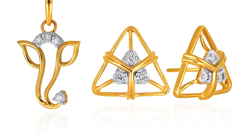
The collection caters to everyday wear, festive gifting, and first-time buyers, offering a wide range of designs from pendants, earrings, and rings to deity-inspired pieces, diamond-studded accents, and contemporary geometric styles. Each piece embodies Senco’s hallmark craftsmanship, ensuring beauty and trust remain uncompromised.
“With Dhanteras and Diwali around the corner, our 9 carat gold collection allows more people to own real gold without stretching their budgets,” said Senco Gold & Diamonds CEO Suvankar Sen. “With hallmarking in place, customers can shop with confidence knowing they’re getting both quality and value.”
Director Joita Sen added, “Though the karatage is lower, the design, detailing, and craftsmanship remain true to Senco’s heritage. This launch builds on the success of our 18 carat and 14 carat, bridging aspiration with accessibility.”
The initiative also aligns with the government of India and BIS’s efforts to include lower karatages like 9 carat in the hallmarking framework, ensuring authenticity and quality assurance for budget-conscious buyers.
With consumer preferences shifting towards lightweight, wearable jewellery, Senco’s 9 carat collection taps into this trend, offering strength, style, and affordability. This festive season, Senco ensures that everyone can celebrate milestones, joy, and tradition with real gold in hand.
Brands
Godrej clarifies ‘GI’ identifier after logo similarity debate
Says GI is not a logo, will not replace Godrej signature across products.
MUMBAI: In a branding storm where shapes did the talking, Godrej is now spelling things out. Godrej Industries Group (GIG) has issued a clarification on its newly introduced ‘GI’ identifier, addressing questions around its purpose and design following a wave of online criticism. At the centre of the debate were two concerns: whether the new mark replaces the long-standing Godrej logo, and whether its geometric design mirrors other corporate identities.
The company has drawn a clear line. The Godrej signature logo, it said, remains unchanged and continues to be the sole logo across all consumer-facing products and services. The ‘GI’ mark, by contrast, is not a logo but a corporate group identifier intended for use alongside the Godrej signature or company name, and aimed at stakeholders such as investors, media and talent rather than consumers.
The need for such a distinction stems from the 2024 restructuring of the broader Godrej Group into two separate business entities. With both continuing to operate under the same Godrej name and signature, the identifier is positioned as a way to differentiate the Godrej Industries Group at a corporate level.
The rollout, however, triggered a broader conversation on design originality. Critics pointed to similarities between the GI mark’s geometric composition and logos used by companies globally, raising questions about distinctiveness.
Responding to this, GIG said its intellectual property and legal review found that such overlaps are common in minimalist, geometry-led design systems. Basic forms such as circles and rectangles appear across dozens of brand identities worldwide, the company noted.
It added that the identifier emerged from an extensive design process and was chosen for its simplicity, allowing it to sit alongside the Godrej signature without competing visually. While acknowledging that elemental shapes may appear less distinctive in isolation, the group emphasised that the mark is part of a broader identity system that includes a custom typeface, sonic branding and other proprietary elements.
Following legal and ethical assessments, the company said it found no impediment to using the identifier, reiterating that the GI mark is a corporate tool not a consumer-facing symbol.
In short, the logo isn’t changing but the conversation around it certainly has.


