e-commerce
Amazon tweaks new app logo after comparison with Hitler’s moustache
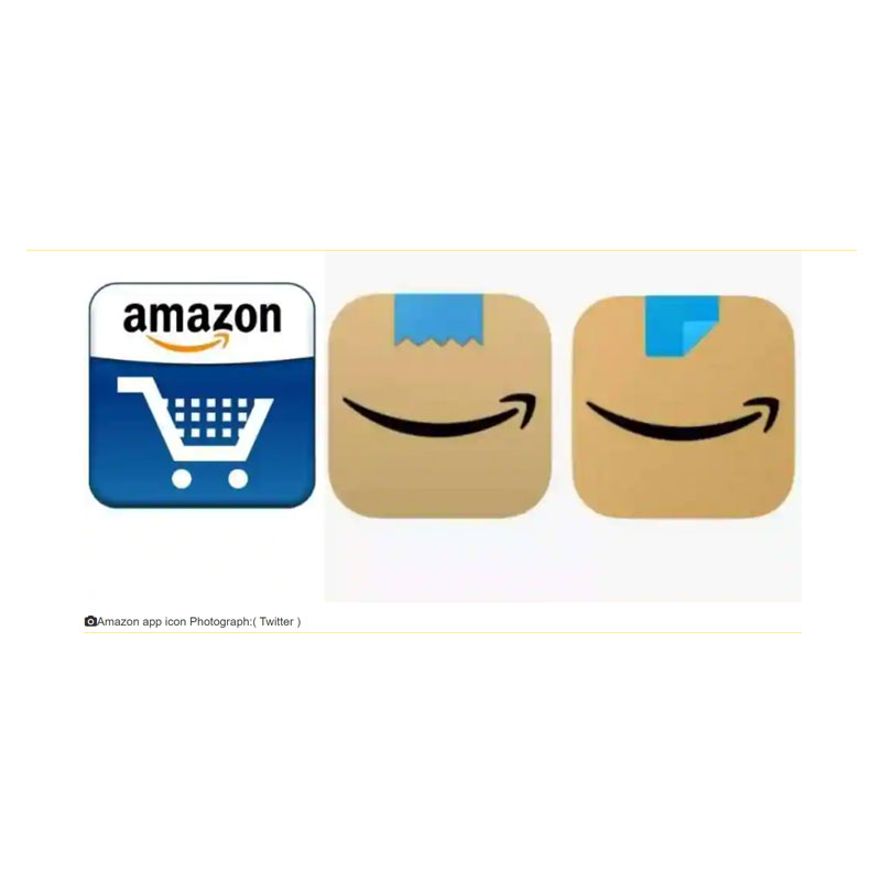
MUMBAI: If you have ever ordered a package from Amazon, you would be familiar with their product packaging- an ubiquitous brown cardboard box with a black adhesive tape running along its sides. Taking this imagery even further, the e-commerce giant had unveiled its new app icon in January featuring a brown box with a jagged piece of blue tape, right above its trademark smile-shaped arrow — overall, giving the icon the appearance of a smiling face. But unfortunately for the online retailer, it evoked anything but smiles from certain sections of social media.
The logo came under fire from some netizens globally, who felt that the blue tape, positioned above the smiling arrow logo, had an uncanny resemblance to the infamous toothbrush moustache sported by German dictator, Adolf Hitler. Some went so far as to claim that the new app icon reminded them of a smirking Hitler. The comparison blew up social media until Amazon decided to come up with a new logo to quell the outrage.
The e-tailer, which had updated its new logo across most regional app stores, quietly rolled out a minor update to its icon. The new logo now has the blue tape, minus the jagged edge and folded at the corner to remove any iota of resemblance to the ‘provocative’ moustache.
https://twitter.com/alexhern/status/1366396140116131842?ref_src=twsrc%5Etfw%7Ctwcamp%5Etweetembed%7Ctwterm%5E1366396140116131842%7Ctwgr%5E%7Ctwcon%5Es1_c10&ref_url=https%3A%2F%2Fd-3643645932941219977.ampproject.net%2F2102200206005%2Fframe.html
“Amazon is always exploring new ways to delight our customers. We designed the new icon to spark anticipation, excitement, and joy when customers start their shopping journey on their phone, just as they do when they see our boxes on their doorstep,” said the company’s spokesperson of the original change from the age-old shopping-cart icon.
It was unclear if criticism of the new logo prompted the second redesign this year for the company which advertises itself as “delivering smiles to customers’ doorsteps”.
Coming on the heels of another logo change by yet another e-commerce player — Myntra after indignation from an Indian citizen — it is evident that corporations are treading on eggshells when it comes to their branding. The Indian fashion e-tailer headquartered in Bengaluru, Karnataka had to alter its app icon after an NGO charged the M-shaped logo was offensive and derogatory towards women. Myntra changed the logo soon after a complaint was lodged with the cyber cell in Mumbai by Avesta Foundation's Naaz Patel, noting that the brand’s signage resembled a naked woman with splayed legs, and was hence "obscene".
The logo, with some minor tweaks to the original, was changed across Myntra's website, app and packaging material. The matter, however, drew a mixed response from netizens. While some welcomed the company's decision to change the logo, many said such demands for logo changes seemed whimsical.
![]()
Ironically, a few also said the complaint exaggerated and brought to notice the supposed structure of the logo, which many would not have cared to notice otherwise; going on to add that they "cannot unsee it now".
So then the question arises, in an era of social media outrage and trolling where do brands draw the line? The ability of social media to highlight trends or criticisms cannot be discounted, more so for an e-commerce platform. With the online space becoming more expansive and diverse, consumer expectations for companies to be sensitive to the experiences of different groups has only grown. However, opinion remains divided on whether brands should bend over backward to consider all the possible ways people could misuse or misinterpret their logos.