Brands
Spotify turns up the volume on I-Pop icons live
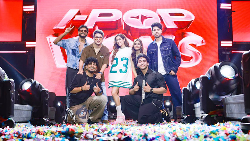
MUMBAI: Pop goes India, and Spotify just gave it a stage to match. On November 7, Mumbai pulsed to the beat of Spotify I-Pop Icons Live, the streaming giant’s first-ever live celebration of India’s thriving pop scene. Featuring electric performances by King, Armaan Malik, Jonita Gandhi, Aditya Rikhari, Kushagra, Hansika Pareek and Sanju Rathod, the night marked a defining moment for I-Pop’s growing cultural footprint.
I-Pop, short for Indian Pop, has rapidly become one of Spotify’s most streamed genres, spanning languages, moods and borders. Aditya Rikhari’s “Sahiba” currently rules the Spotify weekly top songs India chart, while twelve of the top twenty tracks are I-Pop hits, proof that the genre has officially gone mainstream.
Since launching I-Pop Icons in 2024, Spotify has seen over 4 lakh followers tune in, with companion playlists like I-Pop rising, I-Pop chill and I-Pop Party creating a full-fledged sonic universe for fans.
“Over the last few years, we’ve seen the consumption of I-Pop increase significantly,” said Spotify India head of music and podcast Dhruvank Vaidya. “With I-Pop Icons Live, we’re not just curating playlists, we’re building a movement that connects artists and their biggest fans.”
The artists lighting up the stage are already household names. King’s Maan Meri Jaan was Spotify India’s most-streamed song of 2023; Armaan Malik, with over 23 million followers, continues to bridge global and Indian pop; while Jonita Gandhi and Aditya Rikhari are defining the new sound of urban India. Rising stars like Hansika Pareek, Kushagra and Sanju Rathod added fresh flavour, with Marathi pop’s breakout anthem Gulabi Sadi creating history as the first in its language to cross 100 million streams.
As the lights dimmed and the beats lingered, one thing was clear, I-Pop isn’t just India’s next big sound. It’s already here, loud, proud and streaming on repeat.
Brands
Godrej clarifies ‘GI’ identifier after logo similarity debate
Says GI is not a logo, will not replace Godrej signature across products.
MUMBAI: In a branding storm where shapes did the talking, Godrej is now spelling things out. Godrej Industries Group (GIG) has issued a clarification on its newly introduced ‘GI’ identifier, addressing questions around its purpose and design following a wave of online criticism. At the centre of the debate were two concerns: whether the new mark replaces the long-standing Godrej logo, and whether its geometric design mirrors other corporate identities.
The company has drawn a clear line. The Godrej signature logo, it said, remains unchanged and continues to be the sole logo across all consumer-facing products and services. The ‘GI’ mark, by contrast, is not a logo but a corporate group identifier intended for use alongside the Godrej signature or company name, and aimed at stakeholders such as investors, media and talent rather than consumers.
The need for such a distinction stems from the 2024 restructuring of the broader Godrej Group into two separate business entities. With both continuing to operate under the same Godrej name and signature, the identifier is positioned as a way to differentiate the Godrej Industries Group at a corporate level.
The rollout, however, triggered a broader conversation on design originality. Critics pointed to similarities between the GI mark’s geometric composition and logos used by companies globally, raising questions about distinctiveness.
Responding to this, GIG said its intellectual property and legal review found that such overlaps are common in minimalist, geometry-led design systems. Basic forms such as circles and rectangles appear across dozens of brand identities worldwide, the company noted.
It added that the identifier emerged from an extensive design process and was chosen for its simplicity, allowing it to sit alongside the Godrej signature without competing visually. While acknowledging that elemental shapes may appear less distinctive in isolation, the group emphasised that the mark is part of a broader identity system that includes a custom typeface, sonic branding and other proprietary elements.
Following legal and ethical assessments, the company said it found no impediment to using the identifier, reiterating that the GI mark is a corporate tool not a consumer-facing symbol.
In short, the logo isn’t changing but the conversation around it certainly has.


