Brands
Quikr acquires beauty services start-up Salosa
MUMBAI : Quikr has acquired Salosa, an on demand in-home beauty services provider, which has been a partner to QuikrServices. This strategic acquisition is a part of Quikr’s plan to invest Rs.250 crore in its home services vertical, QuikrServices.
Founded by Ex- P&G professionals, Piyush Dhanuka and Anurag Nair, Salosa was launched in September 2015, serving customers in Gurgaon and parts of Delhi. Salosa began first as a marketplace for freelance beauticians and stylists before shifting to a full stack model with an in-house team.
Talking about this acquisition, QuikrServices head PD Sundar said, “Beauty services market is close to $5 billion in India and is growing which is evident from the increasing number of requests we see from Tier-I and Tier-II cities on our platform. On-demand beauty services is an important sub-category and Salosa will help bring very real benefits to our consumers who get easier access to reliable beauty experts.”

“Quikr is amongst the top consumer internet leaders in India today along with being a major player in the services space. We share a similar vision with Quikr and look forward to combining our experience in the beauty domain with Quikr’s scale and strategy to become the best beauty services brand across the country,” said Salosa co founder Anurag Nair.
QuikrServices has been aggressively going deeper in the home services space to provide consumers a richer experience with reliable professionals. Due to the strength of the Quikr brand, the platform has been witnessing a consistent increase in average spend from its consumers over the last 6 months and is seeing a repeat rate of over 60%. QuikrServices has 250,000 service providers offering over 80 types of services for consumers and is being used by 1,00,000 customers every day.


Brands
Godrej clarifies ‘GI’ identifier after logo similarity debate
Says GI is not a logo, will not replace Godrej signature across products.
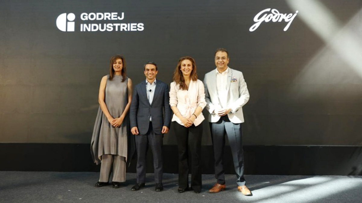
MUMBAI: In a branding storm where shapes did the talking, Godrej is now spelling things out. Godrej Industries Group (GIG) has issued a clarification on its newly introduced ‘GI’ identifier, addressing questions around its purpose and design following a wave of online criticism. At the centre of the debate were two concerns: whether the new mark replaces the long-standing Godrej logo, and whether its geometric design mirrors other corporate identities.
The company has drawn a clear line. The Godrej signature logo, it said, remains unchanged and continues to be the sole logo across all consumer-facing products and services. The ‘GI’ mark, by contrast, is not a logo but a corporate group identifier intended for use alongside the Godrej signature or company name, and aimed at stakeholders such as investors, media and talent rather than consumers.
The need for such a distinction stems from the 2024 restructuring of the broader Godrej Group into two separate business entities. With both continuing to operate under the same Godrej name and signature, the identifier is positioned as a way to differentiate the Godrej Industries Group at a corporate level.
The rollout, however, triggered a broader conversation on design originality. Critics pointed to similarities between the GI mark’s geometric composition and logos used by companies globally, raising questions about distinctiveness.
Responding to this, GIG said its intellectual property and legal review found that such overlaps are common in minimalist, geometry-led design systems. Basic forms such as circles and rectangles appear across dozens of brand identities worldwide, the company noted.
It added that the identifier emerged from an extensive design process and was chosen for its simplicity, allowing it to sit alongside the Godrej signature without competing visually. While acknowledging that elemental shapes may appear less distinctive in isolation, the group emphasised that the mark is part of a broader identity system that includes a custom typeface, sonic branding and other proprietary elements.
Following legal and ethical assessments, the company said it found no impediment to using the identifier, reiterating that the GI mark is a corporate tool not a consumer-facing symbol.
In short, the logo isn’t changing but the conversation around it certainly has.