Brands
G.M Pens a new-age design for Schneider
MUMBAI: G.M Pens International Pvt. Ltd., the pioneer in writing instruments, manufacturer and marketer of ‘Rorito’, announced its strategic technological association with world-class expert, Schneider Schreibgeräte GmbH (Germany), for their new-age Product Design & Development. To mark the commencement of a new and lasting relationship, G.M Pens International signed a Memorandum of Understanding with Schneider, bringing together the two leaders to usher in futuristic technology, in the writing instrument space.
The association with Schneider is meant to enable and strengthen the product portfolio; in addition to offering the very best of technologically superior products to customers. The joining of hands was commemorated by the launch of Rorito Teramax & Rorito Robomax, the most advanced offering from Rorito. Rorito Teramax has been created understating the need gaps among the serious writers especially catering to the student segment. Rorito Robomax has been engineered for the smooth writing seekers.
G.M Pens JMD Indrakumar Mahendran said: “We are delighted to offer our beloved patrons, the best of writing technology with the launch of Rorito Robomax and Rorito Teramax. Our R&D teams have worked extensively to put together a product based on robust research to understand the subtleties and nuances of Indian writing habits, the angle & speed of lettering, the working hours of the average user, the pressure applied on paper & ink delivery required for good legibility etc.”

Schneider Schreibgeräte GmbH MD Christian Schneider said: “We are proud to associate with India’s leading pen brand, Rorito. Our revolutionary approach will lead the writing instrument space as it has a state-of-the-art advanced fluid ink system.”

Brands
Godrej clarifies ‘GI’ identifier after logo similarity debate
Says GI is not a logo, will not replace Godrej signature across products.
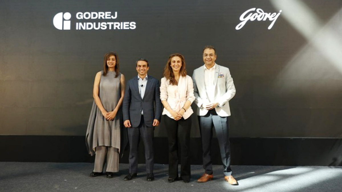
MUMBAI: In a branding storm where shapes did the talking, Godrej is now spelling things out. Godrej Industries Group (GIG) has issued a clarification on its newly introduced ‘GI’ identifier, addressing questions around its purpose and design following a wave of online criticism. At the centre of the debate were two concerns: whether the new mark replaces the long-standing Godrej logo, and whether its geometric design mirrors other corporate identities.
The company has drawn a clear line. The Godrej signature logo, it said, remains unchanged and continues to be the sole logo across all consumer-facing products and services. The ‘GI’ mark, by contrast, is not a logo but a corporate group identifier intended for use alongside the Godrej signature or company name, and aimed at stakeholders such as investors, media and talent rather than consumers.
The need for such a distinction stems from the 2024 restructuring of the broader Godrej Group into two separate business entities. With both continuing to operate under the same Godrej name and signature, the identifier is positioned as a way to differentiate the Godrej Industries Group at a corporate level.
The rollout, however, triggered a broader conversation on design originality. Critics pointed to similarities between the GI mark’s geometric composition and logos used by companies globally, raising questions about distinctiveness.
Responding to this, GIG said its intellectual property and legal review found that such overlaps are common in minimalist, geometry-led design systems. Basic forms such as circles and rectangles appear across dozens of brand identities worldwide, the company noted.
It added that the identifier emerged from an extensive design process and was chosen for its simplicity, allowing it to sit alongside the Godrej signature without competing visually. While acknowledging that elemental shapes may appear less distinctive in isolation, the group emphasised that the mark is part of a broader identity system that includes a custom typeface, sonic branding and other proprietary elements.
Following legal and ethical assessments, the company said it found no impediment to using the identifier, reiterating that the GI mark is a corporate tool not a consumer-facing symbol.
In short, the logo isn’t changing but the conversation around it certainly has.