Brands
John Jacobs aims to clock Rs 500 cr rev by March 2021
MUMBAI: Eyewear brand by Lenskart, John Jacobs is aspiring to drive Rs 500 crore in revenue in the coming two years as it will strengthen its retail presence and expand the product portfolio by adding six more stores in next two months. The brand already has eight stores spread across Delhi, Pune, and Bengaluru. It is also aiming to set up about 50 stores by March 2021.
John Jacobs business head Manan Duggal shared that the brand is witnessing strong growth. “We expect to close this fiscal with a top line of Rs 180 crore. By March 2021, we expect our revenues to touch Rs 500 crore.
He added that about 40 per cent of the sales are driven by online channels, with the rest coming from offline stores.

Last year, Lenskart had said it will invest $4 million in John Jacobs to fuel the brand’s expansion plans.
“We are aggressively growing our presence both in online and offline. The brand is already retailing through Lenskart outlets (over 450 in more than 100 cities). The aim is to take the number of our own stores from 8 now to 50, by March 2021, covering all major metro cities,” he said, adding that the store expansion will entail investment of about Rs 10-15 crore.
John Jacobs is also in discussions with fashion retail chains for distribution of its products.
“In terms of online reach, we are already there on Lenskart and Amazon.in and will soon be available on Flipkart as well,” Duggal said, adding that the brand is aggressively expanding its product portfolio as well.
John Jacobs recently introduced a new eye-wear delivery model where the brand delivers eyeglasses, fitted with powered lenses, in a 20-minute time-frame.
The service, currently available in select stores in Bengaluru, will be expanded to Delhi and Pune as well, Duggal said. He added that with the new service, the brand expects to see 30-40 per cent upside in orders.


Brands
Godrej clarifies ‘GI’ identifier after logo similarity debate
Says GI is not a logo, will not replace Godrej signature across products.
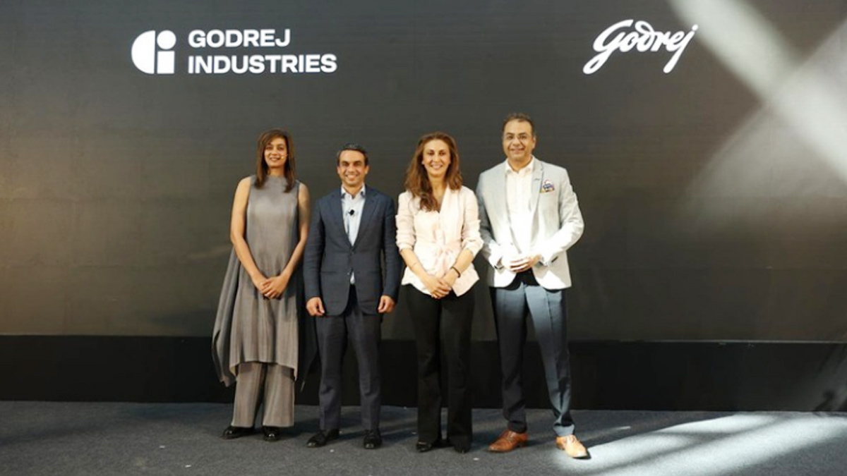
MUMBAI: In a branding storm where shapes did the talking, Godrej is now spelling things out. Godrej Industries Group (GIG) has issued a clarification on its newly introduced ‘GI’ identifier, addressing questions around its purpose and design following a wave of online criticism. At the centre of the debate were two concerns: whether the new mark replaces the long-standing Godrej logo, and whether its geometric design mirrors other corporate identities.
The company has drawn a clear line. The Godrej signature logo, it said, remains unchanged and continues to be the sole logo across all consumer-facing products and services. The ‘GI’ mark, by contrast, is not a logo but a corporate group identifier intended for use alongside the Godrej signature or company name, and aimed at stakeholders such as investors, media and talent rather than consumers.
The need for such a distinction stems from the 2024 restructuring of the broader Godrej Group into two separate business entities. With both continuing to operate under the same Godrej name and signature, the identifier is positioned as a way to differentiate the Godrej Industries Group at a corporate level.
The rollout, however, triggered a broader conversation on design originality. Critics pointed to similarities between the GI mark’s geometric composition and logos used by companies globally, raising questions about distinctiveness.
Responding to this, GIG said its intellectual property and legal review found that such overlaps are common in minimalist, geometry-led design systems. Basic forms such as circles and rectangles appear across dozens of brand identities worldwide, the company noted.
It added that the identifier emerged from an extensive design process and was chosen for its simplicity, allowing it to sit alongside the Godrej signature without competing visually. While acknowledging that elemental shapes may appear less distinctive in isolation, the group emphasised that the mark is part of a broader identity system that includes a custom typeface, sonic branding and other proprietary elements.
Following legal and ethical assessments, the company said it found no impediment to using the identifier, reiterating that the GI mark is a corporate tool not a consumer-facing symbol.
In short, the logo isn’t changing but the conversation around it certainly has.