Connect with us

Brands

First cry no more as Pee Safe tackles first periods with zero fear

Published

on

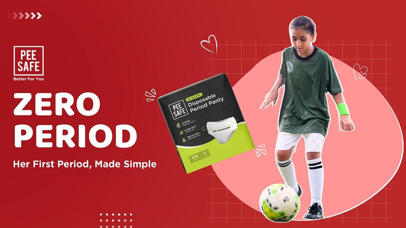
MUMBAI: What do an 8-year-old footballer, a referee, and a nutrition coach have in common? They’re all part of Pee Safe’s mission to make periods less panic, more power. Marking Menstrual Hygiene Day with both emotion and impact, Pee Safe launched its new campaign #ZeroPeriod, a heartfelt initiative to tackle the fear and silence surrounding first periods. The digital video commercial (DVC) at the centre of the campaign portrays the experience of a young footballer who starts her first period mid-game capturing confusion, stigma, and eventually, empowerment.

At the core of Zero Period is Pee Safe’s Disposable Period Panty, designed specifically for first-time menstruators. Think: leak-proof, ultra-absorbent, breathable underwear that feels like everyday wear, not an awkward afterthought. It’s a simple innovation aiming to give girls one less reason to leave the game whether it’s sport, school, or simply being themselves.

According to Pee Safe founder Vikas Bagaria said, “Zero Period is about making space for honest conversations around menstruation, especially the first one. For many young girls, that experience can be confusing and isolating. Our intent with this campaign is to challenge the idea that periods are a disruption or something to be hidden. We want girls to feel equipped, reassured, and uninterrupted in whatever they choose to do.”

Advertisement

According to Pee Safe co-founder Rithish Kumar said, “We notice young girls stepping away from activities they love because of the fear or stigma attached to menstruation. With Zero Period, we want to change that by fostering understanding and support, particularly in environments like schools and sports. Our goal is simple: to help make periods easier, not just physically, but emotionally and socially too.”

The campaign goes beyond storytelling, it includes real-life advocates such as Divya Kumari, a national-level kabaddi referee, and Dr Ankita Pathak, a former kho-kho player and nutrition coach for the National Games 2025. Together, they’re proof that periods shouldn’t bench ambition.

In collaboration with the SRF Foundation and Akhandjyoti Foundation, Pee Safe is taking this movement offline as well. The brand is conducting on-ground menstrual hygiene awareness sessions in underserved communities and across top schools like KR Mangalam, GD Goenka, Bal Bharati, and Delhi Public School.

Advertisement

These sessions designed to offer accurate information, emotional reassurance, and free access to hygiene products aim to give young girls the confidence to manage their periods with dignity, minus the fear.

With over 500 students already reached and more sessions underway, Pee Safe is scoring high on both empathy and impact. First periods may always come with nerves, but thanks to Zero Period, they may now come with fewer exits and more goals.

Advertisement
Click to comment

Leave a Reply

Your email address will not be published. Required fields are marked *

Brands

Godrej clarifies ‘GI’ identifier after logo similarity debate

Says GI is not a logo, will not replace Godrej signature across products.

Published

on

MUMBAI: In a branding storm where shapes did the talking, Godrej is now spelling things out. Godrej Industries Group (GIG) has issued a clarification on its newly introduced ‘GI’ identifier, addressing questions around its purpose and design following a wave of online criticism. At the centre of the debate were two concerns: whether the new mark replaces the long-standing Godrej logo, and whether its geometric design mirrors other corporate identities.

The company has drawn a clear line. The Godrej signature logo, it said, remains unchanged and continues to be the sole logo across all consumer-facing products and services. The ‘GI’ mark, by contrast, is not a logo but a corporate group identifier intended for use alongside the Godrej signature or company name, and aimed at stakeholders such as investors, media and talent rather than consumers.

The need for such a distinction stems from the 2024 restructuring of the broader Godrej Group into two separate business entities. With both continuing to operate under the same Godrej name and signature, the identifier is positioned as a way to differentiate the Godrej Industries Group at a corporate level.

Advertisement

The rollout, however, triggered a broader conversation on design originality. Critics pointed to similarities between the GI mark’s geometric composition and logos used by companies globally, raising questions about distinctiveness.

Responding to this, GIG said its intellectual property and legal review found that such overlaps are common in minimalist, geometry-led design systems. Basic forms such as circles and rectangles appear across dozens of brand identities worldwide, the company noted.

It added that the identifier emerged from an extensive design process and was chosen for its simplicity, allowing it to sit alongside the Godrej signature without competing visually. While acknowledging that elemental shapes may appear less distinctive in isolation, the group emphasised that the mark is part of a broader identity system that includes a custom typeface, sonic branding and other proprietary elements.

Advertisement

Following legal and ethical assessments, the company said it found no impediment to using the identifier, reiterating that the GI mark is a corporate tool not a consumer-facing symbol.

In short, the logo isn’t changing but the conversation around it certainly has.

Advertisement
Continue Reading

Advertisement News18
Advertisement
Advertisement
Advertisement
Advertisement Whtasapp
Advertisement Year Enders

Indian Television Dot Com Pvt Ltd

Signup for news and special offers!

Copyright © 2026 Indian Television Dot Com PVT LTD

This will close in 10 seconds