Brands
PowerMax expands to Qatar, Saudi Arabia, Dubai & UK
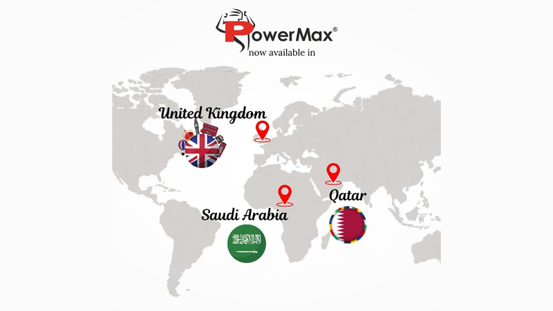
Mumbai: PowerMax, an Indian fitness equipment brand, has expanded globally to countries like Qatar, Saudi Arabia, the UK, and Dubai. PowerMax, known for its innovative fitness solutions, has built a reputation for quality, performance, and customer satisfaction, transforming homes and gyms.
Having established a strong foundation in India, PowerMax has consistently provided top-quality fitness equipment to millions of gym enthusiasts. Building on this success, the brand is now prepared to enter global markets, focusing on key areas such as Germany, Canada, the US, and Mexico — regions with significant growth in the fitness industry. PowerMax plans to expand its presence through physical stores and by partnering with Amazon, Noon, and Carrefouruae to strengthen its online reach.
This expansion marks a significant milestone for PowerMax, enabling fitness enthusiasts worldwide to easily purchase its products from home. By extending its excellence in fitness globally, the brand aims to empower people to transform their bodies with its exceptional exercise equipment
“We are beyond thrilled for this new chapter that PowerMax is writing,” said PowerMax managing director Sanjay Goyal. “Entering global markets for us demonstrates not only the strength of our brand but, more importantly, our commitment to world-class fitness solutions. We have no doubt that our products will speak to fitness enthusiasts from around the world and that we shall continue to empower people in attaining their fitness goals.”
PowerMax is committed to providing a top-notch customer experience and building lasting relationships with fitness enthusiasts. Through its high-quality equipment and comprehensive customer support, PowerMax enables people worldwide to engage in physical fitness to achieve a healthier lifestyle.
Brands
Godrej clarifies ‘GI’ identifier after logo similarity debate
Says GI is not a logo, will not replace Godrej signature across products.
MUMBAI: In a branding storm where shapes did the talking, Godrej is now spelling things out. Godrej Industries Group (GIG) has issued a clarification on its newly introduced ‘GI’ identifier, addressing questions around its purpose and design following a wave of online criticism. At the centre of the debate were two concerns: whether the new mark replaces the long-standing Godrej logo, and whether its geometric design mirrors other corporate identities.
The company has drawn a clear line. The Godrej signature logo, it said, remains unchanged and continues to be the sole logo across all consumer-facing products and services. The ‘GI’ mark, by contrast, is not a logo but a corporate group identifier intended for use alongside the Godrej signature or company name, and aimed at stakeholders such as investors, media and talent rather than consumers.
The need for such a distinction stems from the 2024 restructuring of the broader Godrej Group into two separate business entities. With both continuing to operate under the same Godrej name and signature, the identifier is positioned as a way to differentiate the Godrej Industries Group at a corporate level.
The rollout, however, triggered a broader conversation on design originality. Critics pointed to similarities between the GI mark’s geometric composition and logos used by companies globally, raising questions about distinctiveness.
Responding to this, GIG said its intellectual property and legal review found that such overlaps are common in minimalist, geometry-led design systems. Basic forms such as circles and rectangles appear across dozens of brand identities worldwide, the company noted.
It added that the identifier emerged from an extensive design process and was chosen for its simplicity, allowing it to sit alongside the Godrej signature without competing visually. While acknowledging that elemental shapes may appear less distinctive in isolation, the group emphasised that the mark is part of a broader identity system that includes a custom typeface, sonic branding and other proprietary elements.
Following legal and ethical assessments, the company said it found no impediment to using the identifier, reiterating that the GI mark is a corporate tool not a consumer-facing symbol.
In short, the logo isn’t changing but the conversation around it certainly has.


