Connect with us

Brands

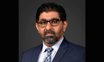
RBI approves Vinay Muralidhar Tonse’s appointment as Yes Bank’s MD & CEO

Published

on

MUMBAI: Yes Bank has lined up its next leader. The Reserve Bank of India on February 4 approved Vinay Muralidhar Tonse as managing director and chief executive officer, setting the stage for a planned handover at the private lender as it steadies its post-crisis rebuild.

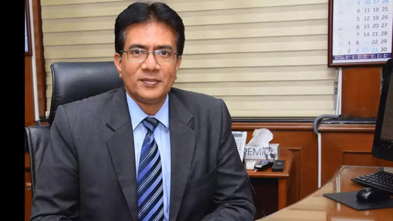
The approval, disclosed in a regulatory filing, is subject to shareholder clearance. Prashant Kumar, the incumbent md and ceo, will continue through his extended term, ensuring continuity while the bank prepares for transition.

Tonse arrives with a long retail-banking pedigree. Until November 30, 2025, he served as md (retail business and operations) at State Bank of India, where he built deep experience in retail lending, distribution and operations—areas crucial for Yes Bank’s growth ambitions. The bank underscored his operational depth and confirmed he is not debarred by Sebi or any authority.

Advertisement

The timing is notable. Yes Bank has spent the past few years repairing its balance sheet, rebuilding trust and sharpening governance after its 2020 rescue. Kumar, first appointed in March 2020 during the reconstruction, has been central to that clean-up. Reappointed in October 2022 and again in 2025, he has overseen a shift towards a more “re-energised, recapitalised and recalibrated” bank.

Kumar’s own SBI career spanned 34 years across credit, finance, HR and operations, from probationary officer in 1983 to senior leadership roles including deputy md and chief financial officer. His tenure at Yes Bank stabilised the ship; Tonse’s task will be to accelerate the voyage.

For a bank once defined by crisis, the narrative is now about succession and scale. The regulator has spoken, the board has moved and the market will watch the next chapter closely. In Indian banking, turnarounds win headlines—but durable growth wins the story.

Advertisement
Click to comment

Leave a Reply

Your email address will not be published. Required fields are marked *

Brands

Godrej clarifies ‘GI’ identifier after logo similarity debate

Says GI is not a logo, will not replace Godrej signature across products.

Published

on

MUMBAI: In a branding storm where shapes did the talking, Godrej is now spelling things out. Godrej Industries Group (GIG) has issued a clarification on its newly introduced ‘GI’ identifier, addressing questions around its purpose and design following a wave of online criticism. At the centre of the debate were two concerns: whether the new mark replaces the long-standing Godrej logo, and whether its geometric design mirrors other corporate identities.

The company has drawn a clear line. The Godrej signature logo, it said, remains unchanged and continues to be the sole logo across all consumer-facing products and services. The ‘GI’ mark, by contrast, is not a logo but a corporate group identifier intended for use alongside the Godrej signature or company name, and aimed at stakeholders such as investors, media and talent rather than consumers.

The need for such a distinction stems from the 2024 restructuring of the broader Godrej Group into two separate business entities. With both continuing to operate under the same Godrej name and signature, the identifier is positioned as a way to differentiate the Godrej Industries Group at a corporate level.

Advertisement

The rollout, however, triggered a broader conversation on design originality. Critics pointed to similarities between the GI mark’s geometric composition and logos used by companies globally, raising questions about distinctiveness.

Responding to this, GIG said its intellectual property and legal review found that such overlaps are common in minimalist, geometry-led design systems. Basic forms such as circles and rectangles appear across dozens of brand identities worldwide, the company noted.

It added that the identifier emerged from an extensive design process and was chosen for its simplicity, allowing it to sit alongside the Godrej signature without competing visually. While acknowledging that elemental shapes may appear less distinctive in isolation, the group emphasised that the mark is part of a broader identity system that includes a custom typeface, sonic branding and other proprietary elements.

Advertisement

Following legal and ethical assessments, the company said it found no impediment to using the identifier, reiterating that the GI mark is a corporate tool not a consumer-facing symbol.

In short, the logo isn’t changing but the conversation around it certainly has.

Advertisement
Continue Reading

Advertisement News18
Advertisement
Advertisement
Advertisement
Advertisement Whtasapp
Advertisement Year Enders

Indian Television Dot Com Pvt Ltd

Signup for news and special offers!

Copyright © 2026 Indian Television Dot Com PVT LTD

This will close in 10 seconds