Brands
Django brings Bergner India on board MasterChef India
MUMBAI: Django has turned up the heat in brand partnerships by bringing together Bergner India and MasterChef India for the show’s upcoming season. The integrated marketing agency has facilitated Bergner India’s entry as the official special partner of MasterChef India, which premieres on 5 January 2026.
The collaboration pairs Bergner’s premium cookware and modern kitchen innovation with a television property that has made cooking competitive, creative and hugely popular. For Bergner, it is a chance to step into millions of Indian kitchens through a platform that celebrates skill, aspiration and everyday culinary ambition.
Django co-founder Vivek Shah, said the match was as natural as a well balanced recipe. ‘MasterChef India is culturally relevant and instinctively aligned with Bergner’s brand ethos. Our focus was to build a partnership that goes beyond screen time and creates long term brand value. We are delighted to help strengthen Bergner’s connection with India’s growing community of home cooks.’

A spokesperson for Bergner India echoed the sentiment, noting that the show mirrors the brand’s philosophy. ‘MasterChef India stands for innovation, precision and passion in the kitchen, values that are central to Bergner. This association allows us to engage with consumers in an authentic and meaningful way. Django played a key strategic role in making this collaboration happen.’
As part of the partnership, Bergner India will feature across on-air brand integrations and digital extensions throughout the season, ensuring the brand stays front and centre as India’s favourite cooking competition unfolds.


Brands
Godrej clarifies ‘GI’ identifier after logo similarity debate
Says GI is not a logo, will not replace Godrej signature across products.
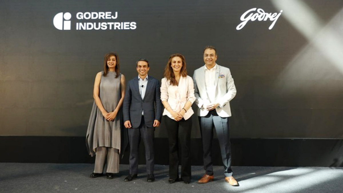
MUMBAI: In a branding storm where shapes did the talking, Godrej is now spelling things out. Godrej Industries Group (GIG) has issued a clarification on its newly introduced ‘GI’ identifier, addressing questions around its purpose and design following a wave of online criticism. At the centre of the debate were two concerns: whether the new mark replaces the long-standing Godrej logo, and whether its geometric design mirrors other corporate identities.
The company has drawn a clear line. The Godrej signature logo, it said, remains unchanged and continues to be the sole logo across all consumer-facing products and services. The ‘GI’ mark, by contrast, is not a logo but a corporate group identifier intended for use alongside the Godrej signature or company name, and aimed at stakeholders such as investors, media and talent rather than consumers.
The need for such a distinction stems from the 2024 restructuring of the broader Godrej Group into two separate business entities. With both continuing to operate under the same Godrej name and signature, the identifier is positioned as a way to differentiate the Godrej Industries Group at a corporate level.
The rollout, however, triggered a broader conversation on design originality. Critics pointed to similarities between the GI mark’s geometric composition and logos used by companies globally, raising questions about distinctiveness.
Responding to this, GIG said its intellectual property and legal review found that such overlaps are common in minimalist, geometry-led design systems. Basic forms such as circles and rectangles appear across dozens of brand identities worldwide, the company noted.
It added that the identifier emerged from an extensive design process and was chosen for its simplicity, allowing it to sit alongside the Godrej signature without competing visually. While acknowledging that elemental shapes may appear less distinctive in isolation, the group emphasised that the mark is part of a broader identity system that includes a custom typeface, sonic branding and other proprietary elements.
Following legal and ethical assessments, the company said it found no impediment to using the identifier, reiterating that the GI mark is a corporate tool not a consumer-facing symbol.
In short, the logo isn’t changing but the conversation around it certainly has.