Connect with us

Brands

Kingfisher Smooth flows into Karnataka’s strong beer market

Published

on

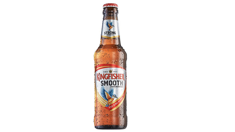
MUMBAI: Strong beer is getting a softer edge. United Breweries Limited has rolled out Kingfisher Smooth in Karnataka, signalling a calculated push to widen Kingfisher’s footprint in India’s mainstream strong beer segment.

The launch targets one of the country’s largest and most influential beer markets. Karnataka, led by Bengaluru’s urban consumption and well-entrenched beer culture, offers the scale and visibility needed for a brand looking to grow beyond a single-state success. The move follows encouraging early consumer response to Kingfisher Smooth in Rajasthan.

Positioned for younger legal-age drinkers, Kingfisher Smooth is designed to bridge a familiar gap in the category: strength without the harshness. Brewed with imported hops and no added sugar, the beer aims to deliver a cleaner, smoother profile while retaining the punch expected by strong beer consumers.

Advertisement

United Breweries sees the variant as a strategic addition rather than a replacement. Kingfisher Strong continues as the flagship full-bodied offering, while Smooth expands choice within the brand’s core portfolio, reflecting changing consumer preferences and drinking occasions.

In Karnataka, Kingfisher Smooth will be available across leading retail outlets. Pricing has been set at Rs 100 for a 330 ml can, Rs 120 for a 330 ml bottle, Rs 155 for a 500 ml can, and Rs 200 for a 650 ml bottle.

With this rollout, UBL is betting that in a market long dominated by bold flavours, a smoother strong beer can still make enough noise to be noticed.

Advertisement


Click to comment

Leave a Reply

Your email address will not be published. Required fields are marked *

Brands

Godrej clarifies ‘GI’ identifier after logo similarity debate

Says GI is not a logo, will not replace Godrej signature across products.

Published

on

MUMBAI: In a branding storm where shapes did the talking, Godrej is now spelling things out. Godrej Industries Group (GIG) has issued a clarification on its newly introduced ‘GI’ identifier, addressing questions around its purpose and design following a wave of online criticism. At the centre of the debate were two concerns: whether the new mark replaces the long-standing Godrej logo, and whether its geometric design mirrors other corporate identities.

The company has drawn a clear line. The Godrej signature logo, it said, remains unchanged and continues to be the sole logo across all consumer-facing products and services. The ‘GI’ mark, by contrast, is not a logo but a corporate group identifier intended for use alongside the Godrej signature or company name, and aimed at stakeholders such as investors, media and talent rather than consumers.

The need for such a distinction stems from the 2024 restructuring of the broader Godrej Group into two separate business entities. With both continuing to operate under the same Godrej name and signature, the identifier is positioned as a way to differentiate the Godrej Industries Group at a corporate level.

Advertisement

The rollout, however, triggered a broader conversation on design originality. Critics pointed to similarities between the GI mark’s geometric composition and logos used by companies globally, raising questions about distinctiveness.

Responding to this, GIG said its intellectual property and legal review found that such overlaps are common in minimalist, geometry-led design systems. Basic forms such as circles and rectangles appear across dozens of brand identities worldwide, the company noted.

It added that the identifier emerged from an extensive design process and was chosen for its simplicity, allowing it to sit alongside the Godrej signature without competing visually. While acknowledging that elemental shapes may appear less distinctive in isolation, the group emphasised that the mark is part of a broader identity system that includes a custom typeface, sonic branding and other proprietary elements.

Advertisement

Following legal and ethical assessments, the company said it found no impediment to using the identifier, reiterating that the GI mark is a corporate tool not a consumer-facing symbol.

In short, the logo isn’t changing but the conversation around it certainly has.

Advertisement
Continue Reading

Advertisement News18
Advertisement
Advertisement
Advertisement
Advertisement Whtasapp
Advertisement Year Enders

Indian Television Dot Com Pvt Ltd

Signup for news and special offers!

Copyright © 2026 Indian Television Dot Com PVT LTD

This will close in 10 seconds