Brands
Lenskart’s next-gen tech frames takes centre stage
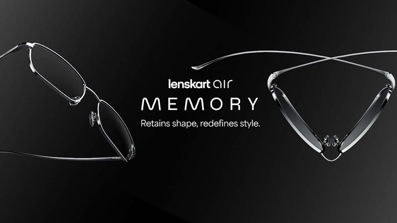
Mumbai: Lenskart the leading eyewear brand is thrilled to unveil its latest innovation in eyewear technology – Memory Metal. The Beta- Titanium cutting-edge material is set to transform the glasses-wearing experience, featuring ultra-flexible and remarkably lightweight frames. These frames not only offer seamless flexibility but also assure enduring durability, marking a significant advancement in eyewear design.
Built to withstand the rigors of everyday life, Lenskart’s new frames redefine expectations with unparalleled shape retention technology. Constructed from the exceptionally durable Beta Titanium that makes them super lightweight and stainless steel making them compatible with high power & progressive prescriptions. These frames not only bend and fold to seamlessly adapt to your lifestyle but also effortlessly spring back to their original form. The addition of adjustable silicone nose pads enhances adaptability, allowing customers to twist and turn with ease, without compromising on comfort.
“We believe that eyewear should not only enhance vision but also reflect personal style,” said Lenskart co-founder Ramneek Khurana. “Our new ultra-flexible and super light frames redefine the standard for comfort and durability in eyewear, providing customers with unmatched flexibility and resilience.”

Beyond their exceptional flexibility, these frames boast a sleek and stylish design. Presented in timeless shapes and vibrant neutral and metallic hues, these frames effortlessly fuse fashion with functionality. Whether you’re heading to the office or enjoying a night out on the town, Memory Metal by Lenskart Air is meticulously crafted to navigate each day, offering a flawless combination of style and resilience. This eyewear is made to last.


Brands
Godrej clarifies ‘GI’ identifier after logo similarity debate
Says GI is not a logo, will not replace Godrej signature across products.
MUMBAI: In a branding storm where shapes did the talking, Godrej is now spelling things out. Godrej Industries Group (GIG) has issued a clarification on its newly introduced ‘GI’ identifier, addressing questions around its purpose and design following a wave of online criticism. At the centre of the debate were two concerns: whether the new mark replaces the long-standing Godrej logo, and whether its geometric design mirrors other corporate identities.
The company has drawn a clear line. The Godrej signature logo, it said, remains unchanged and continues to be the sole logo across all consumer-facing products and services. The ‘GI’ mark, by contrast, is not a logo but a corporate group identifier intended for use alongside the Godrej signature or company name, and aimed at stakeholders such as investors, media and talent rather than consumers.
The need for such a distinction stems from the 2024 restructuring of the broader Godrej Group into two separate business entities. With both continuing to operate under the same Godrej name and signature, the identifier is positioned as a way to differentiate the Godrej Industries Group at a corporate level.
The rollout, however, triggered a broader conversation on design originality. Critics pointed to similarities between the GI mark’s geometric composition and logos used by companies globally, raising questions about distinctiveness.
Responding to this, GIG said its intellectual property and legal review found that such overlaps are common in minimalist, geometry-led design systems. Basic forms such as circles and rectangles appear across dozens of brand identities worldwide, the company noted.
It added that the identifier emerged from an extensive design process and was chosen for its simplicity, allowing it to sit alongside the Godrej signature without competing visually. While acknowledging that elemental shapes may appear less distinctive in isolation, the group emphasised that the mark is part of a broader identity system that includes a custom typeface, sonic branding and other proprietary elements.
Following legal and ethical assessments, the company said it found no impediment to using the identifier, reiterating that the GI mark is a corporate tool not a consumer-facing symbol.
In short, the logo isn’t changing but the conversation around it certainly has.